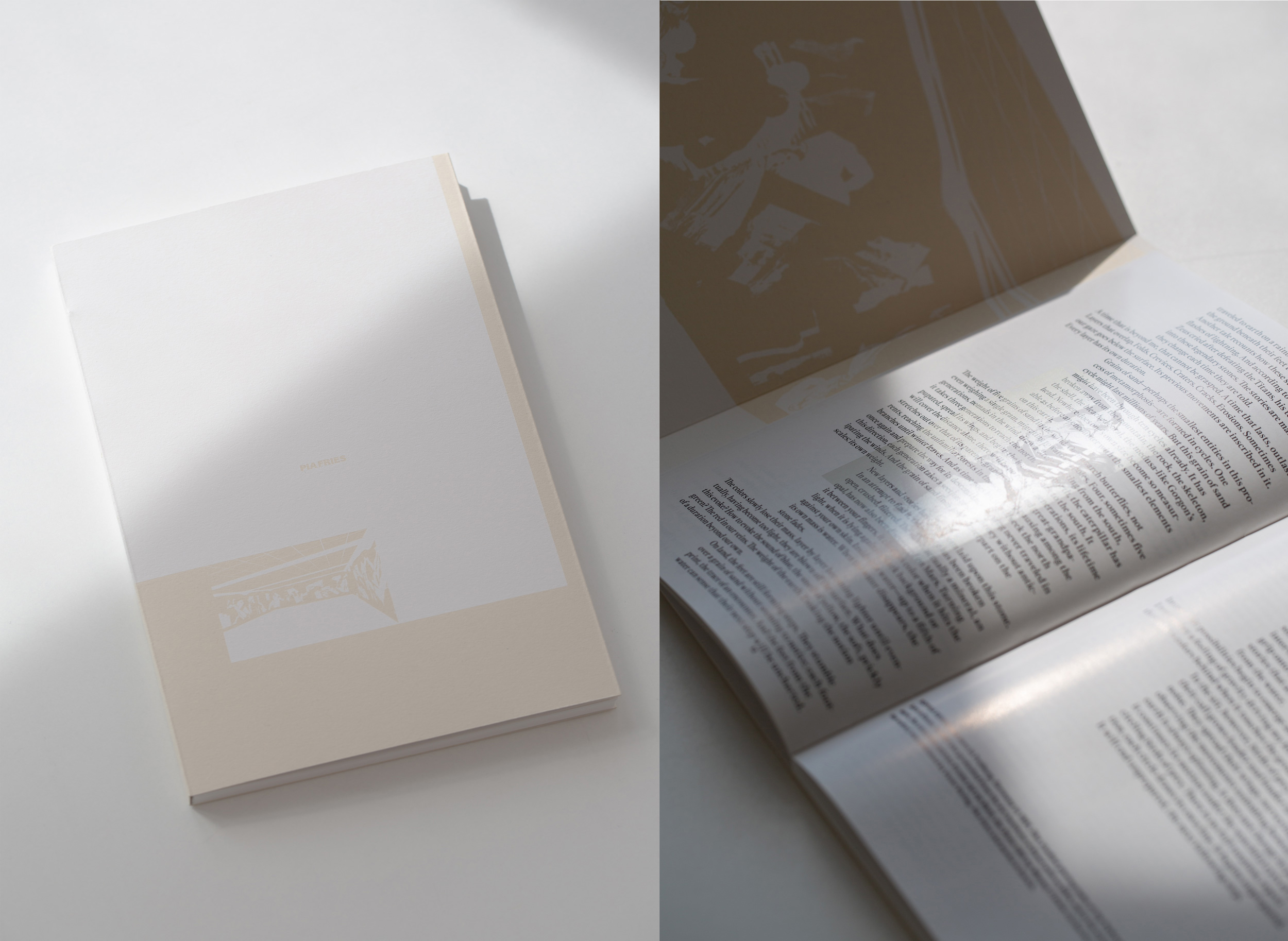
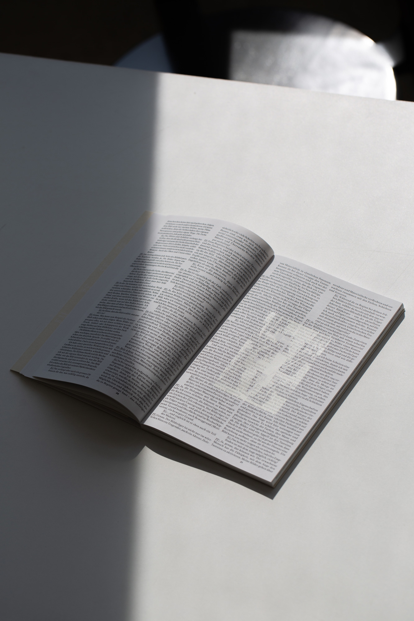
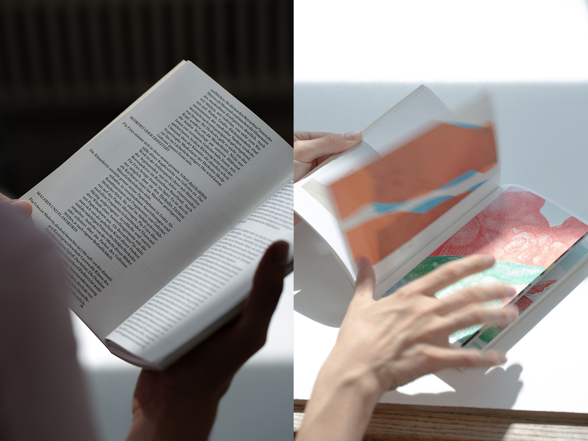
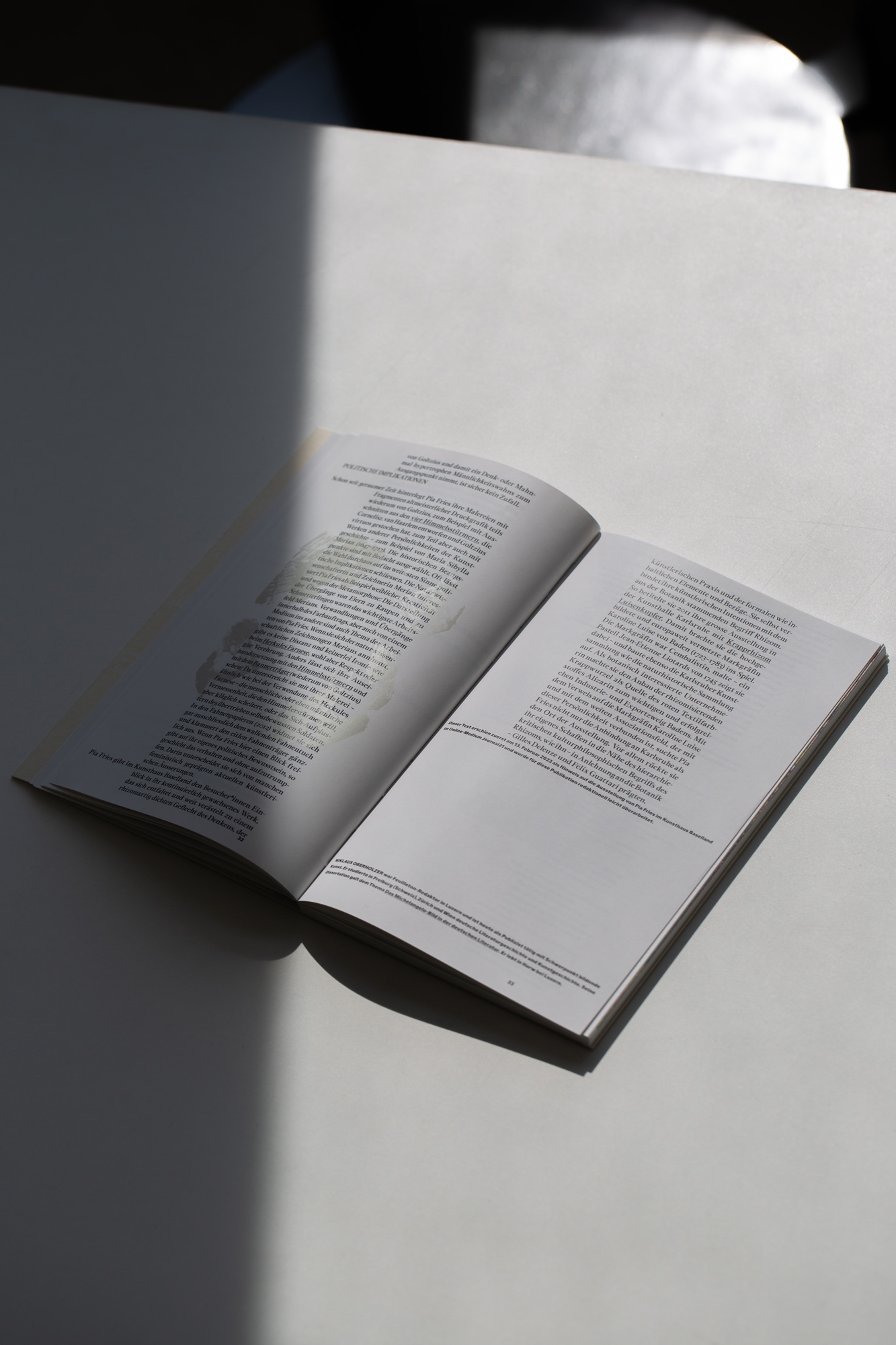
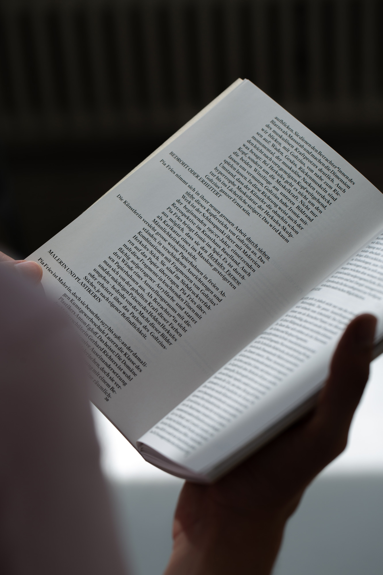
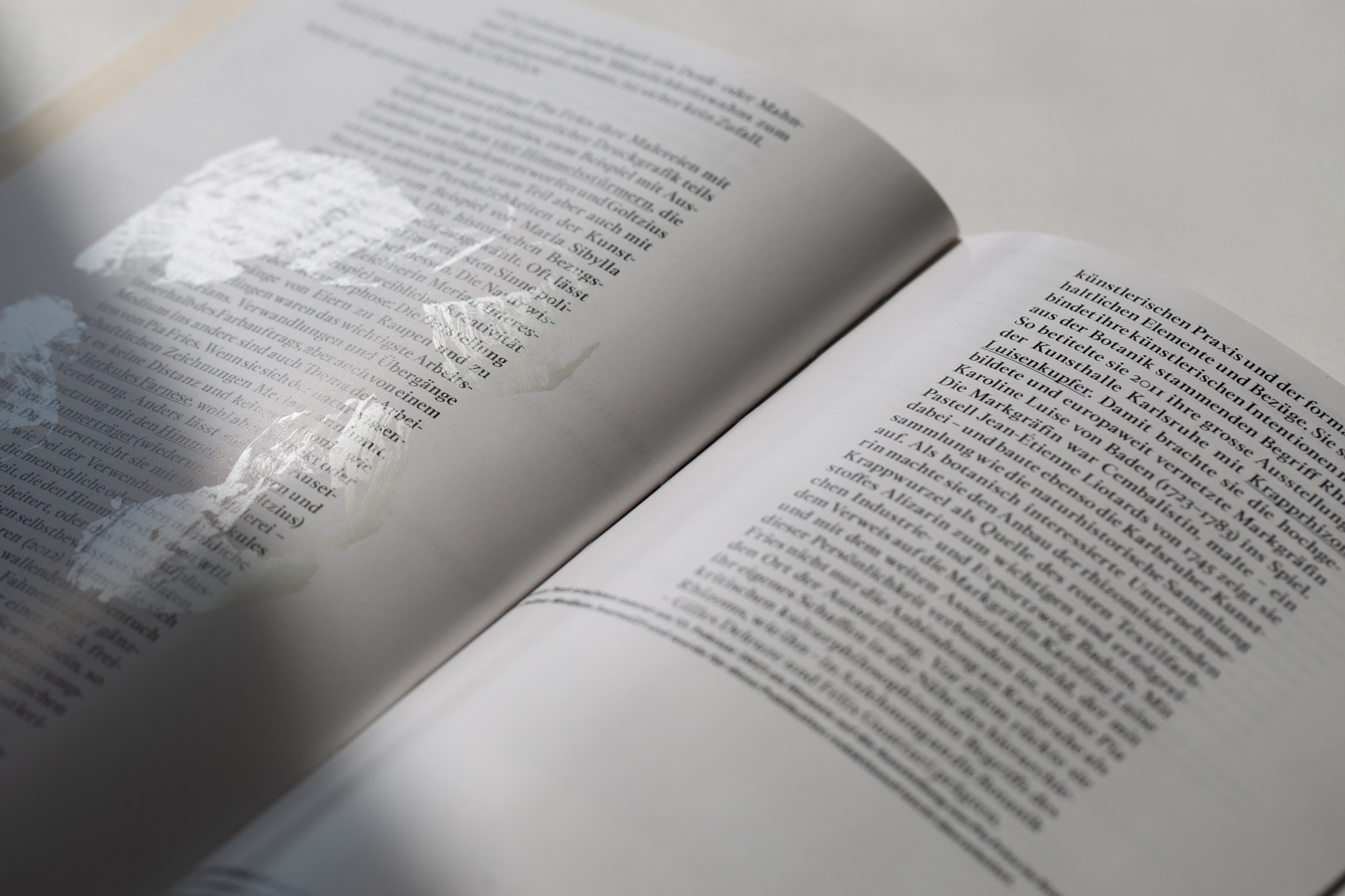
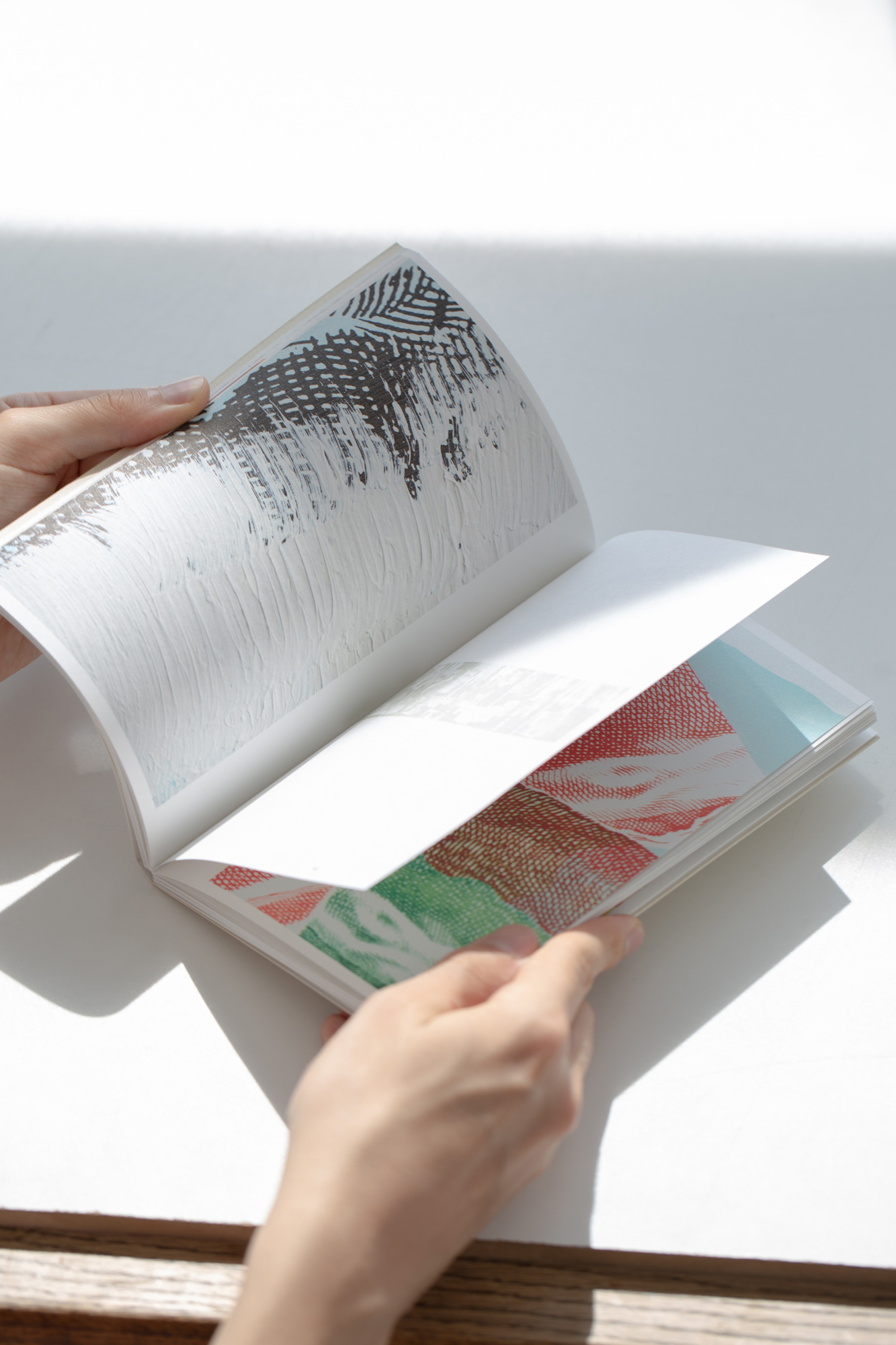
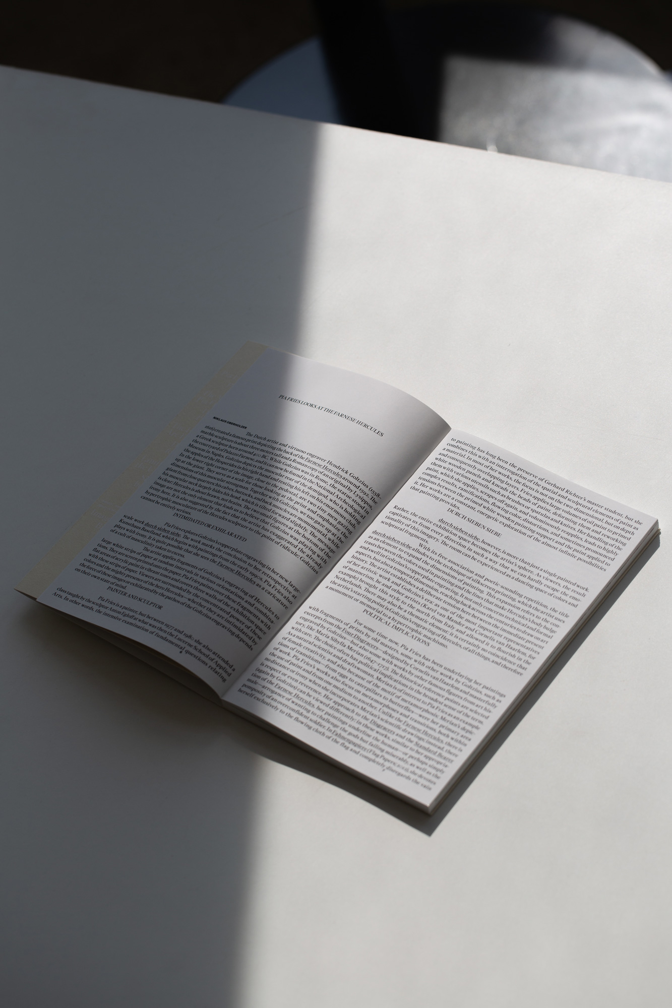
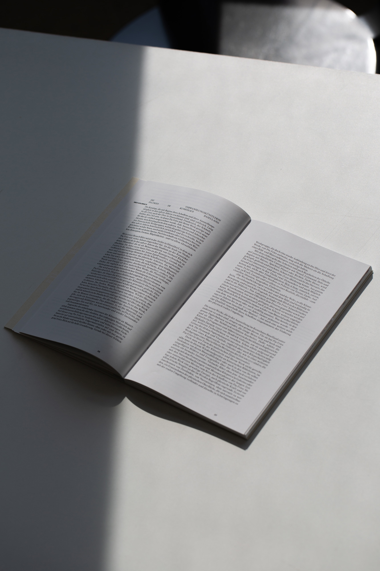
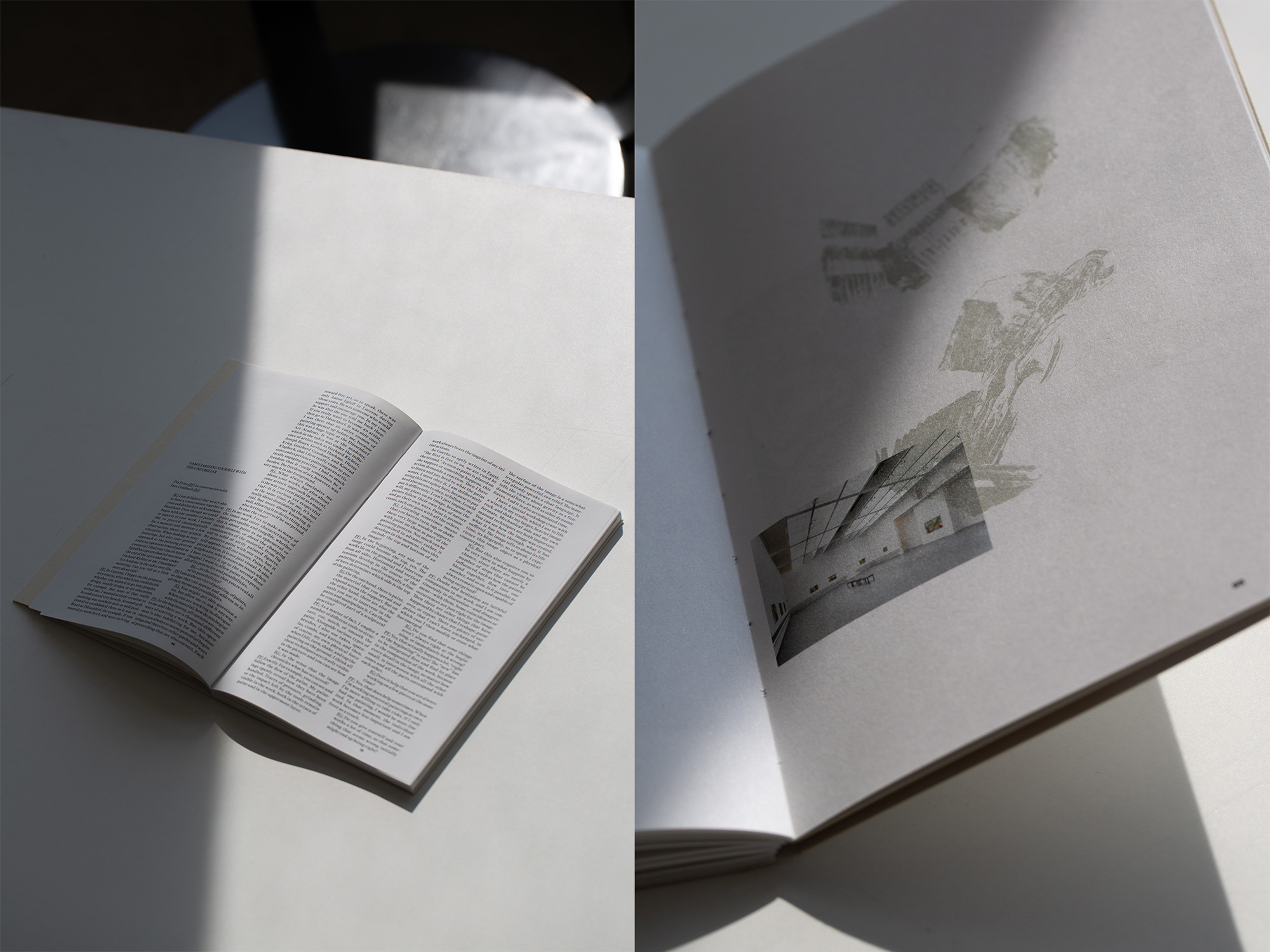
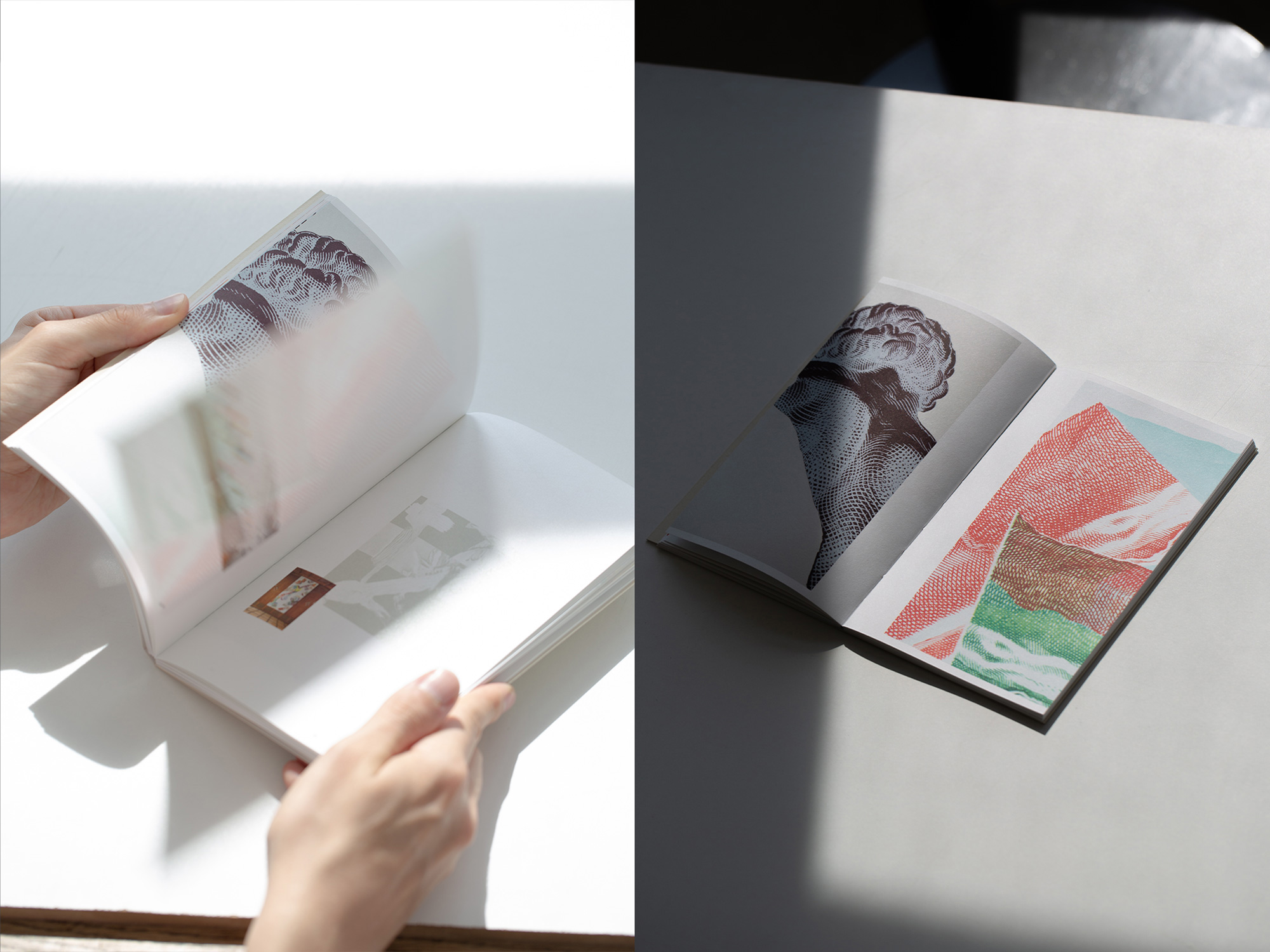
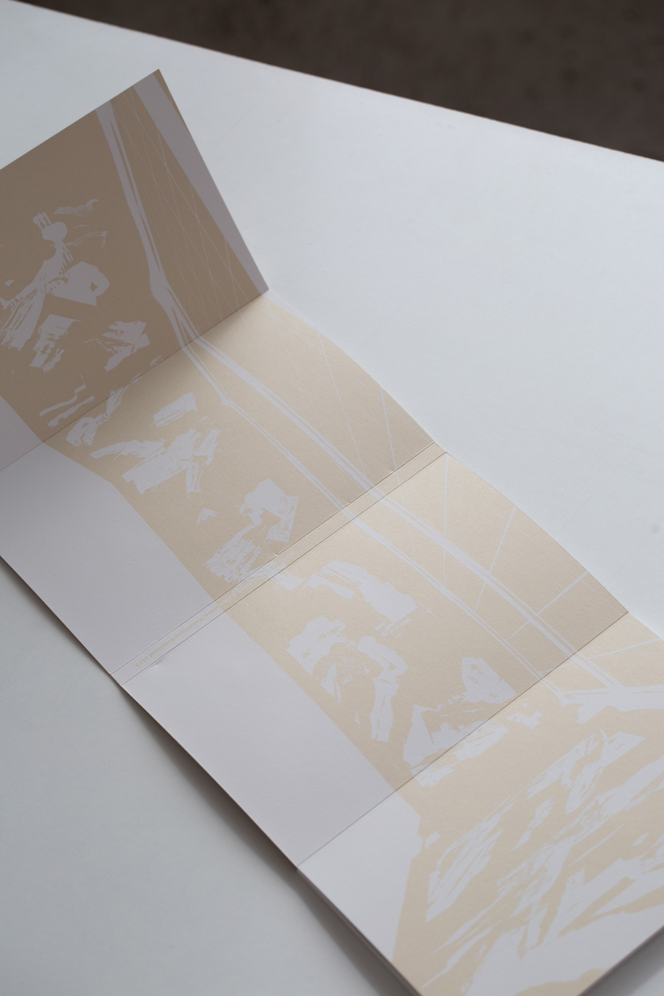
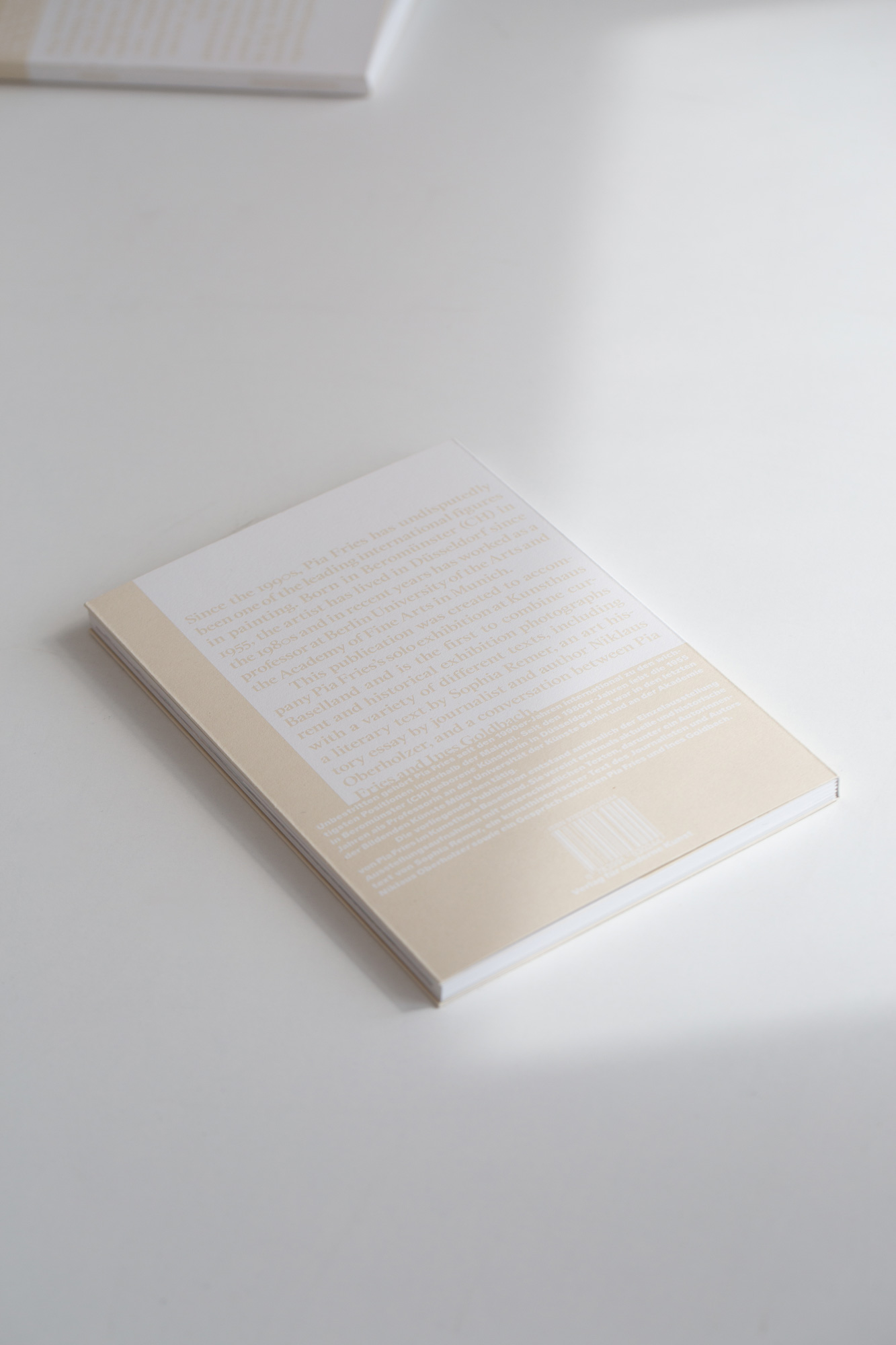
Publication for Pia Fries, accompanying her solo exhibition at Kunsthaus Baselland. The inside of the white screenprinted book-cover is split in two parts. The first part of the publication features a diverse array of text contributions set in a variable grid, overprinted at crucial points by Pia Fries’ work. The second part of the publication showcases exhibitions views at the Kunsthaus Baselland as well as past views, with a focus of the appearance of her artwork in various exhibition spaces.
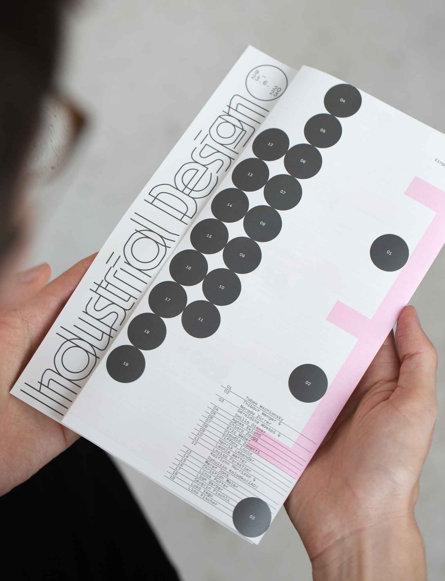
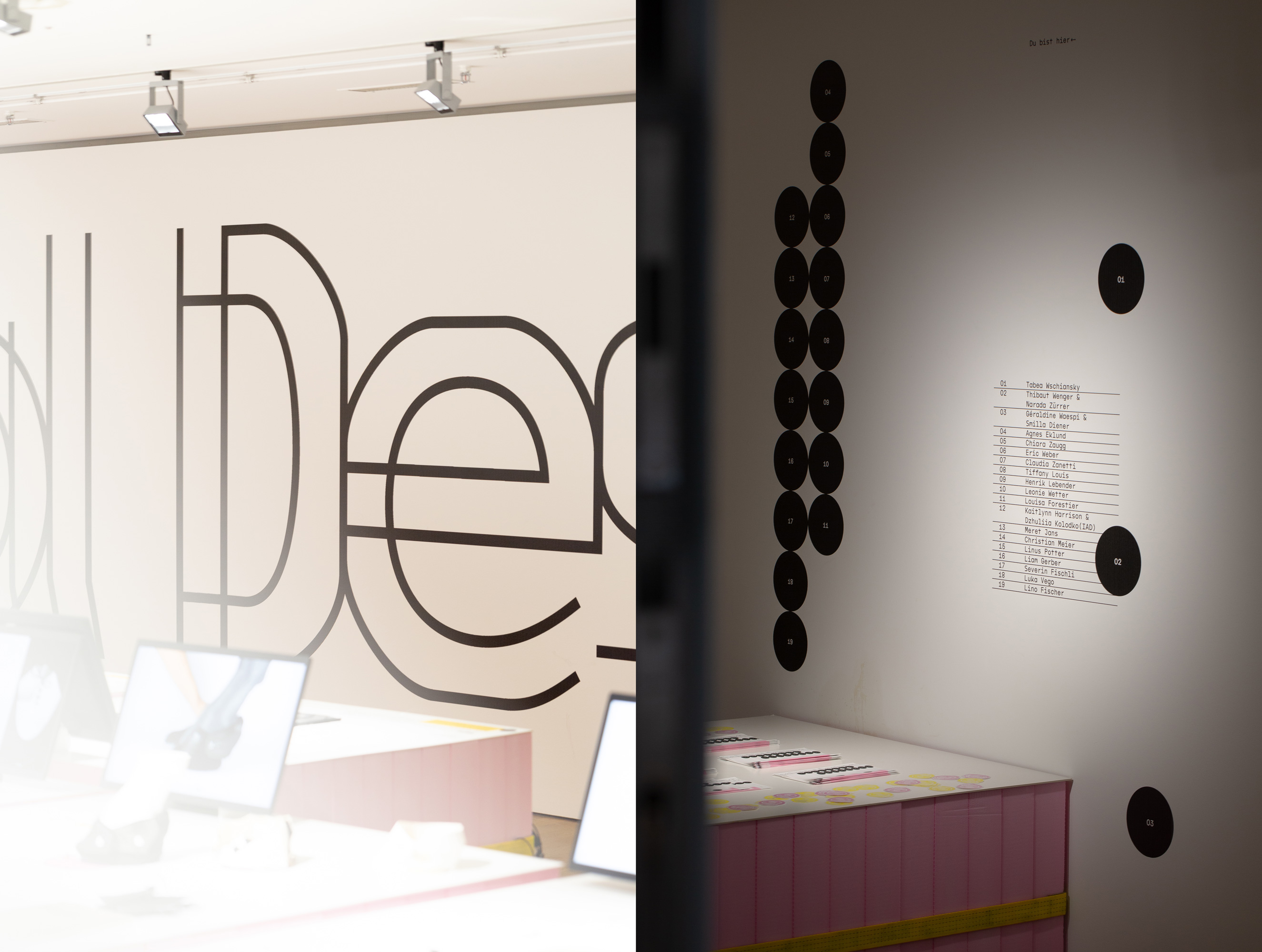
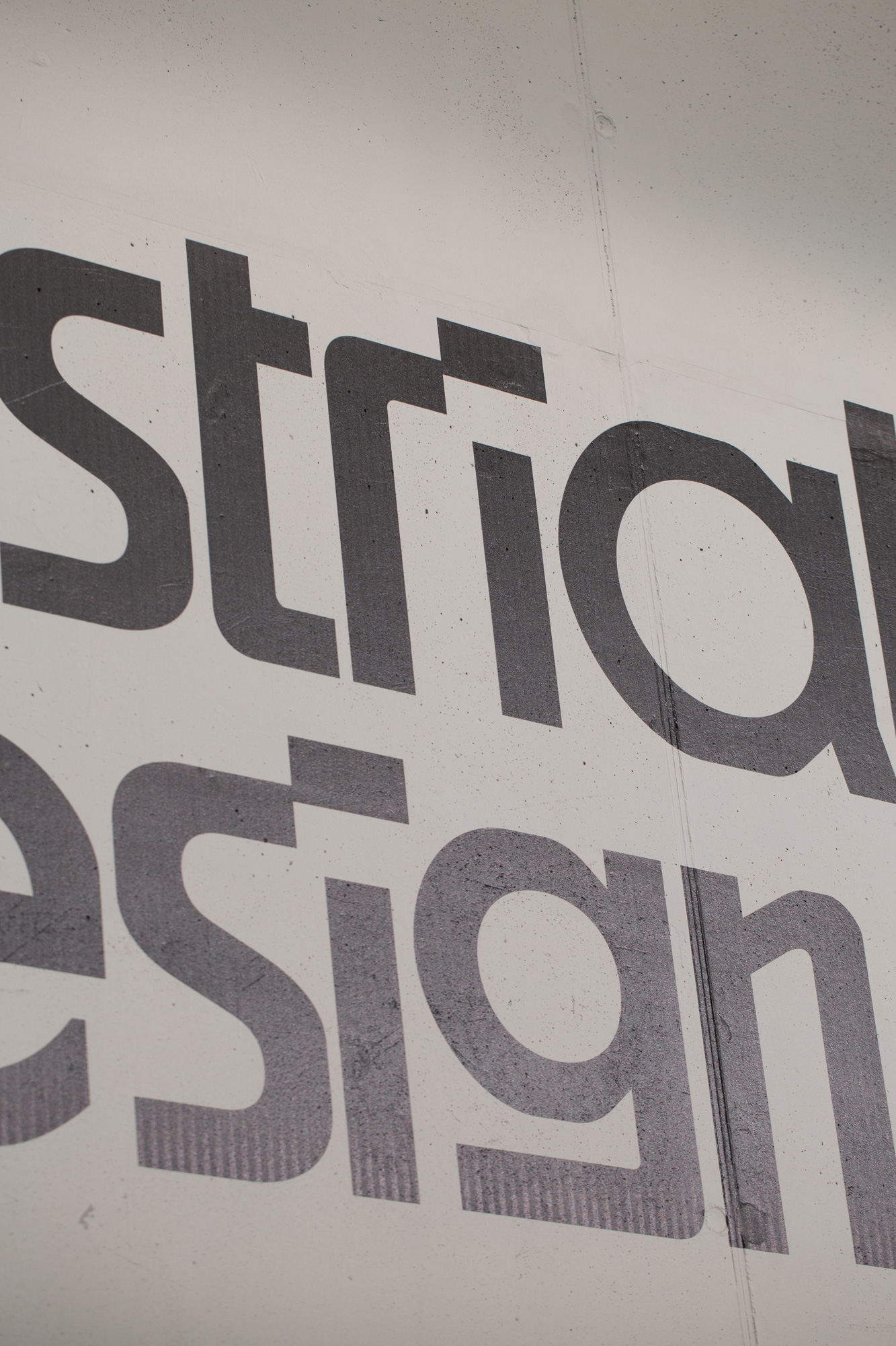
Lettering, printed matter, exhibition graphics and animations for the Industrial Design program diploma exhibition at the Zurich University of the Arts. The sustainable exhibition scenography featuring isolation materials and tension belts functioned as the basis of our concept and design.
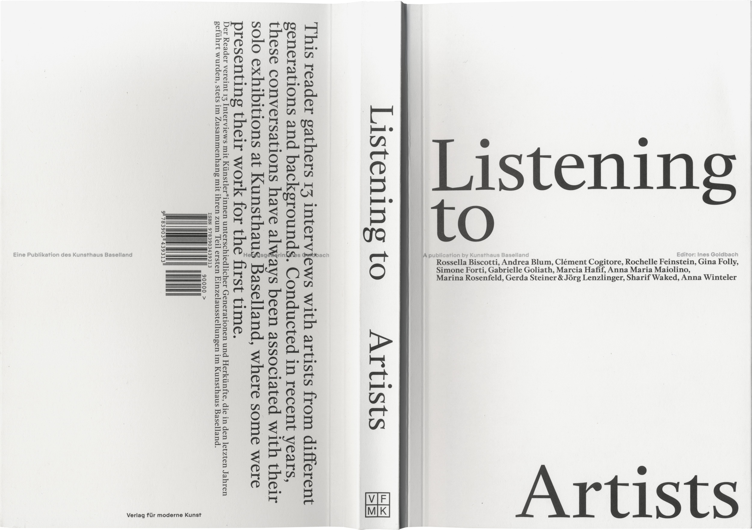
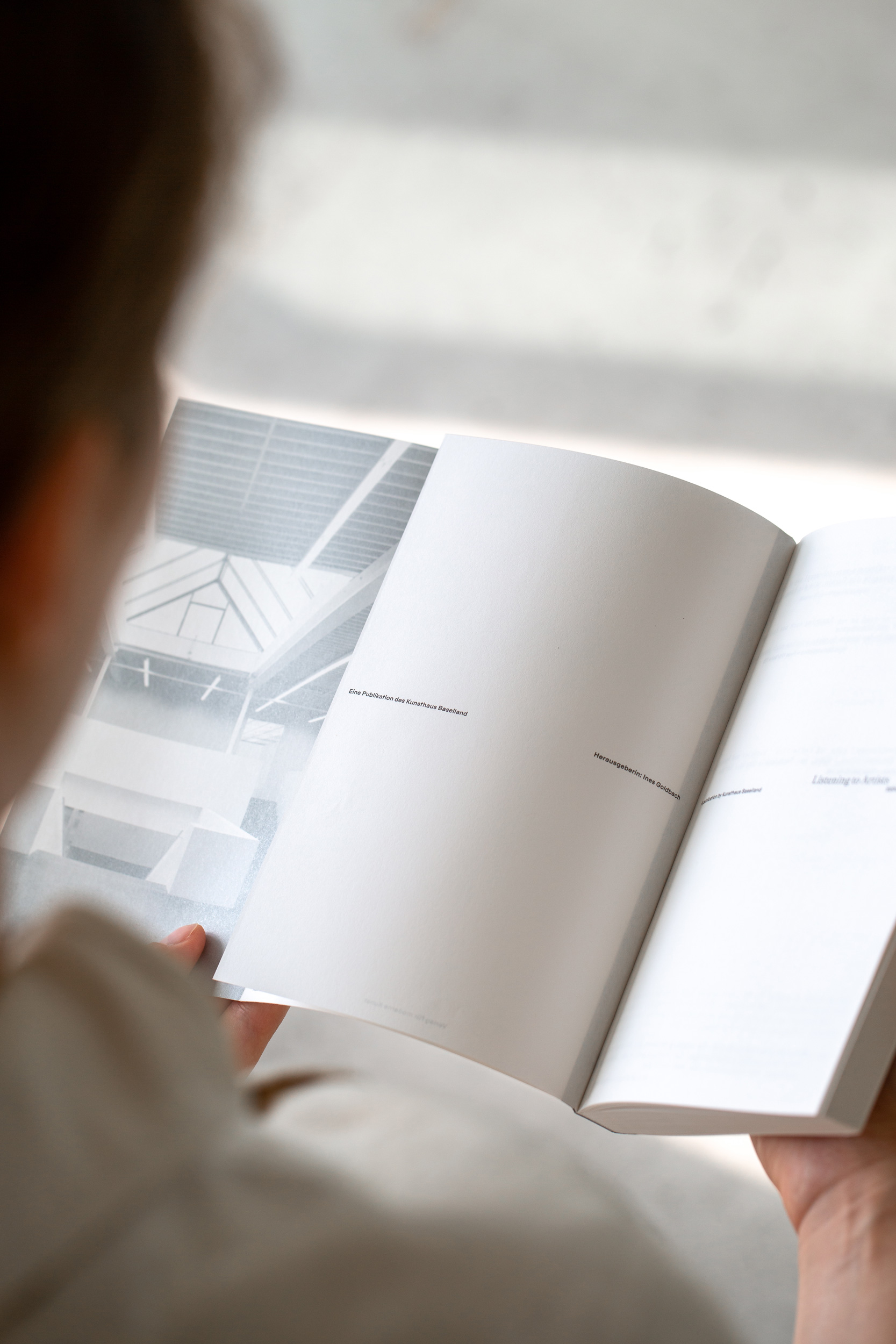
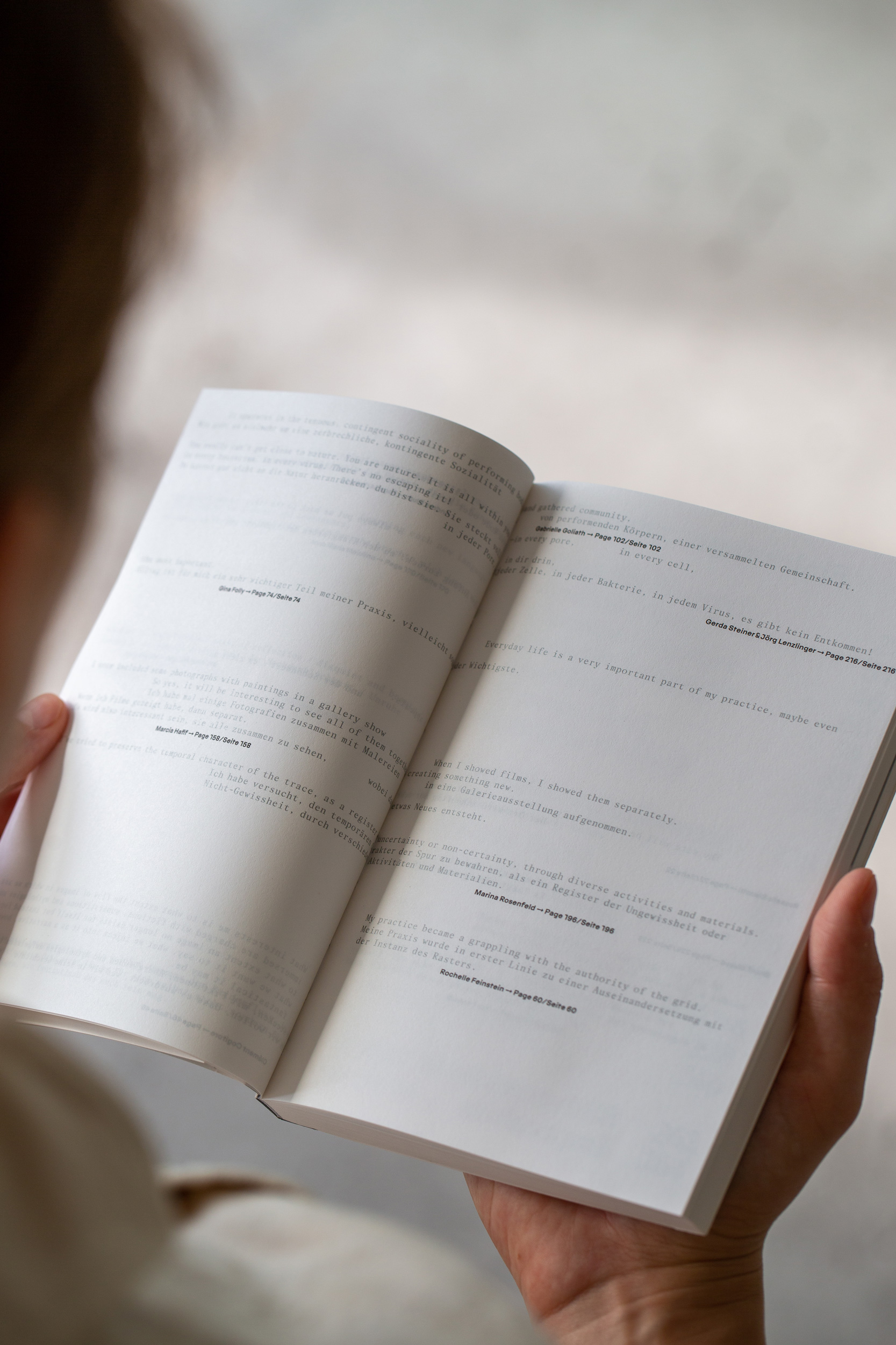
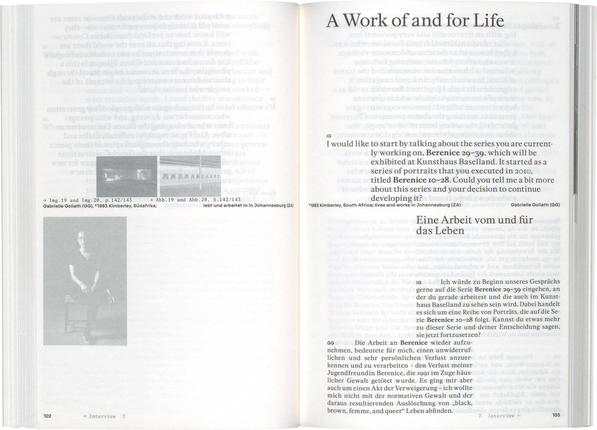
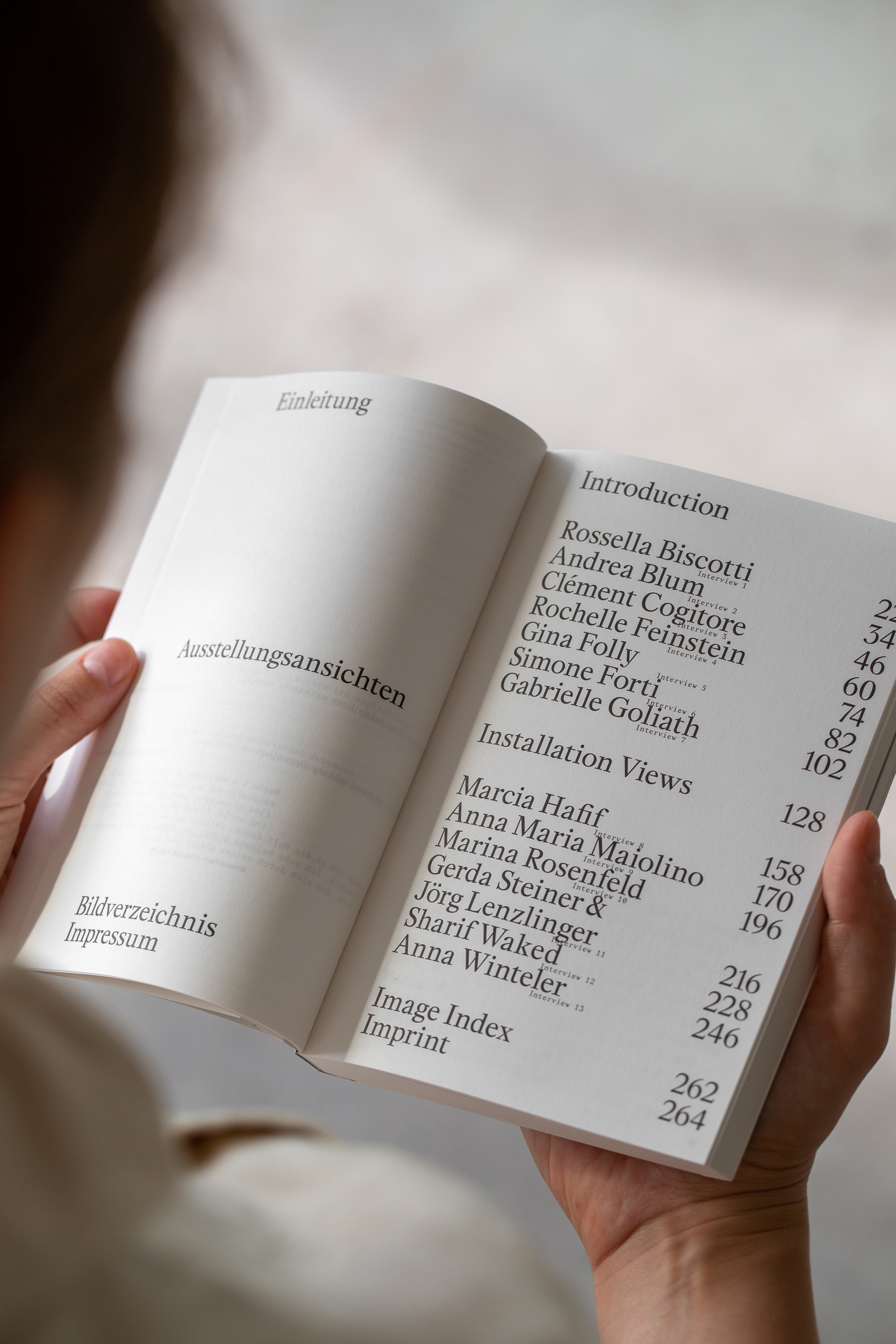
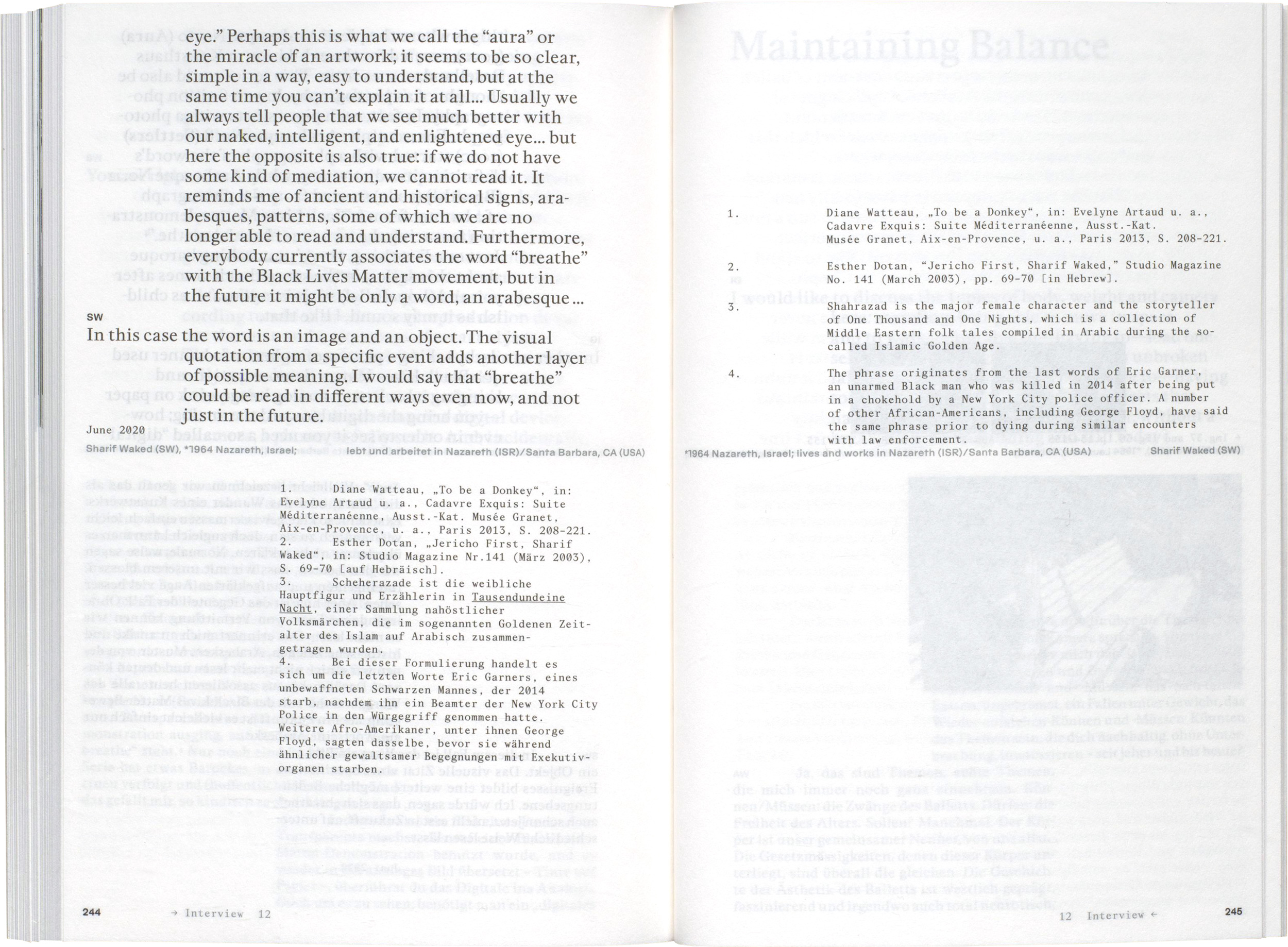
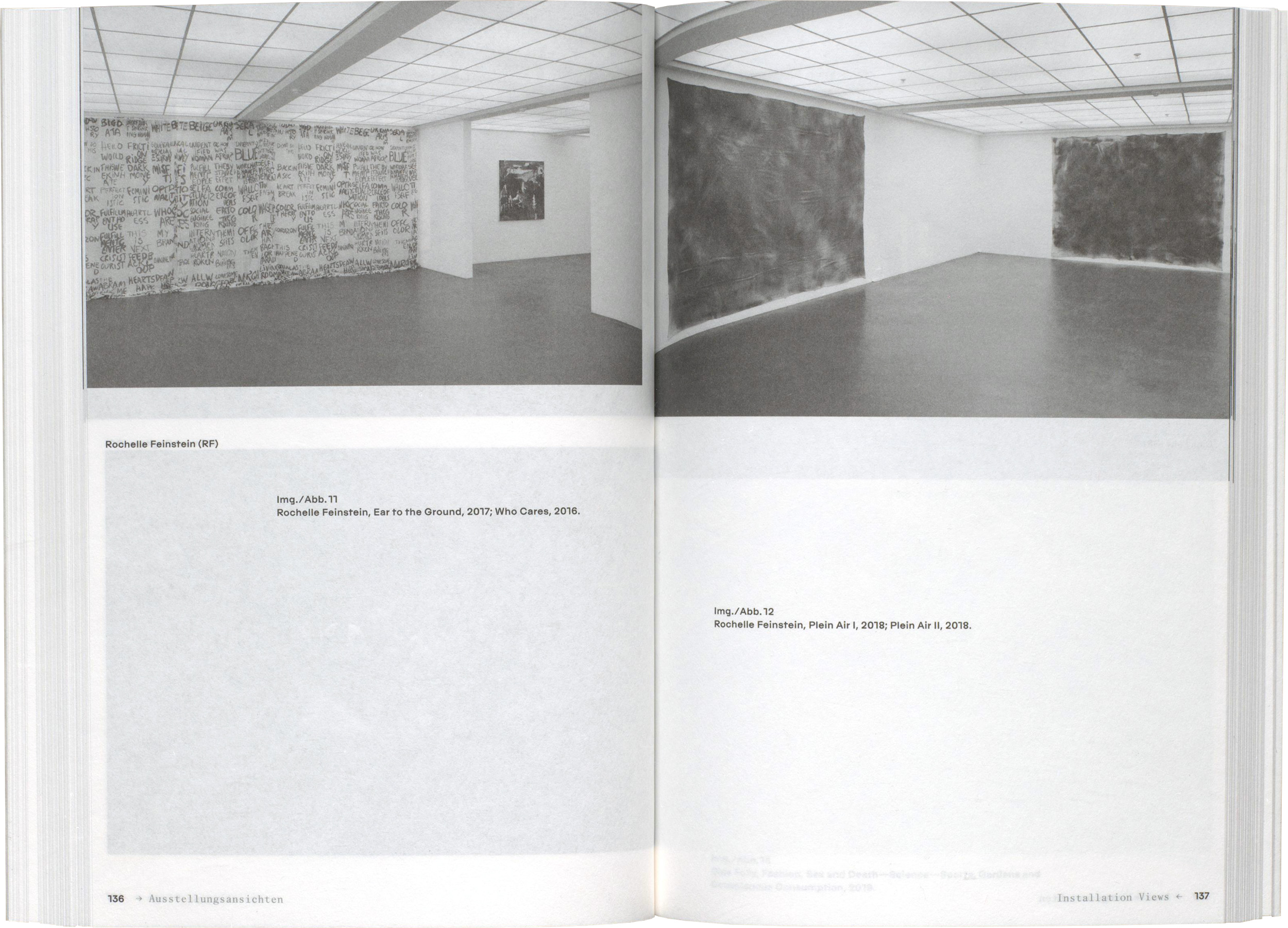
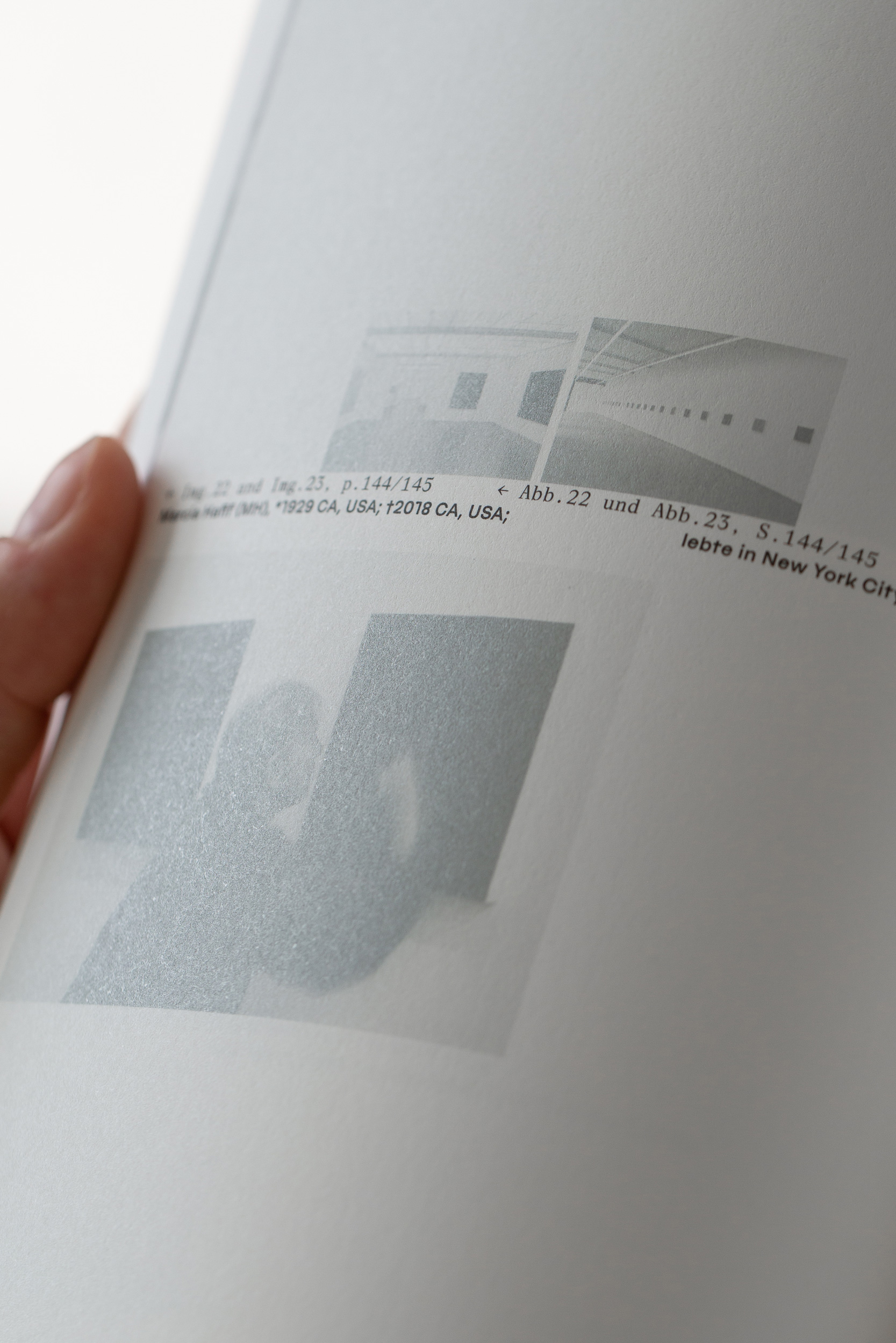
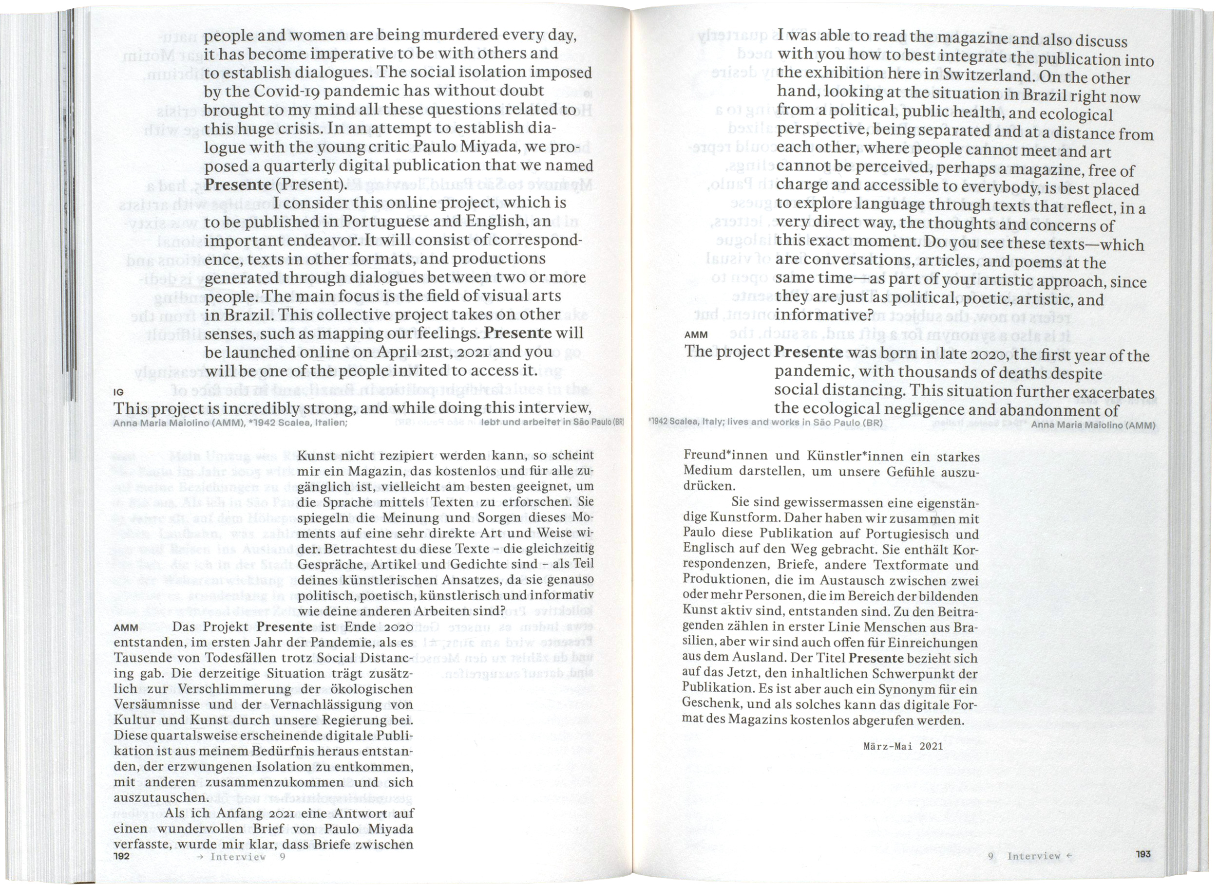
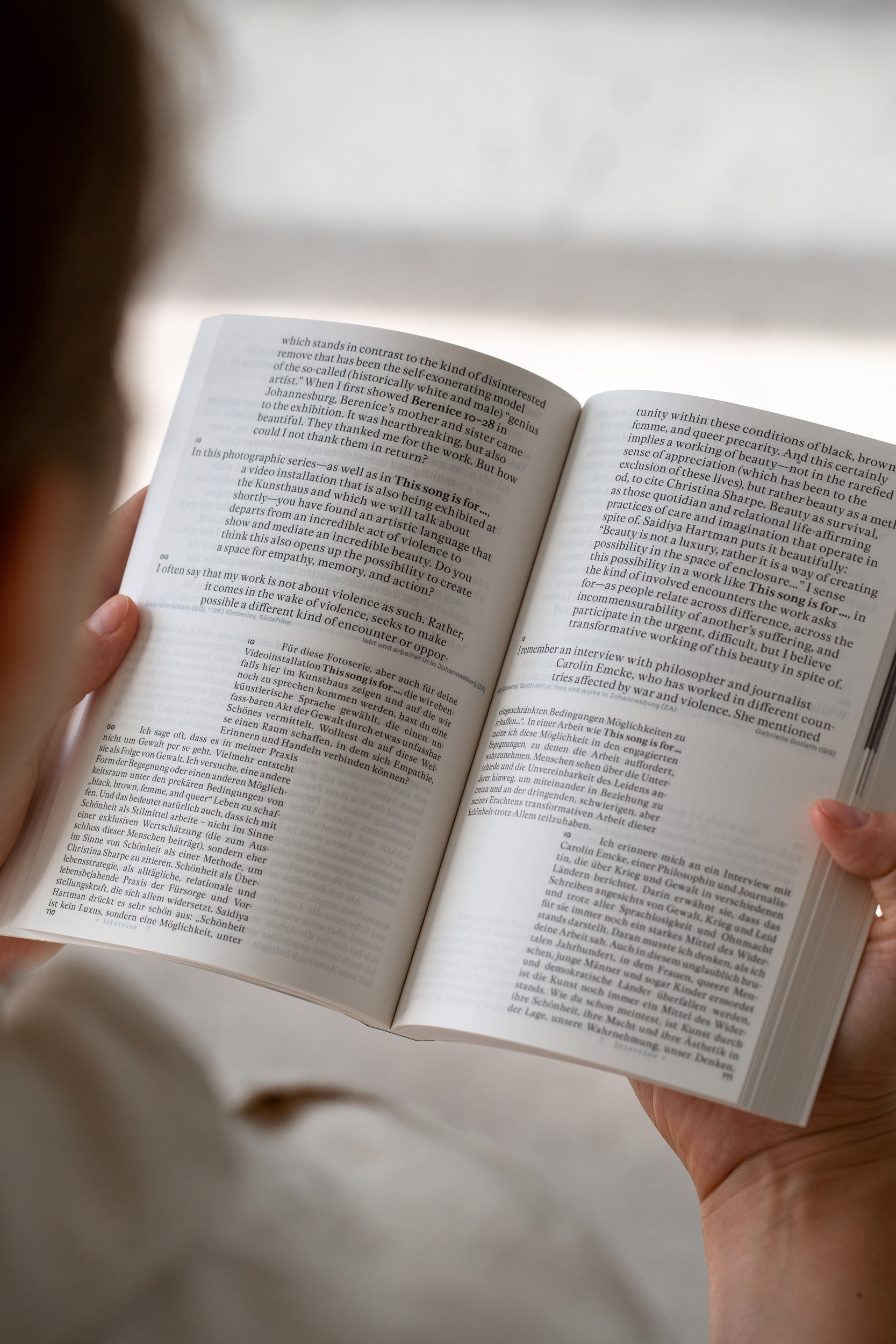
The publication “Listening to Artists” is a handy interview reader. Each interview runs across the two horizontal halves of the book in different layouts, bilingual in parallel. The different dynamics of the conducted conversations create diverse page views, which are held together by the consistently centered artist bios.
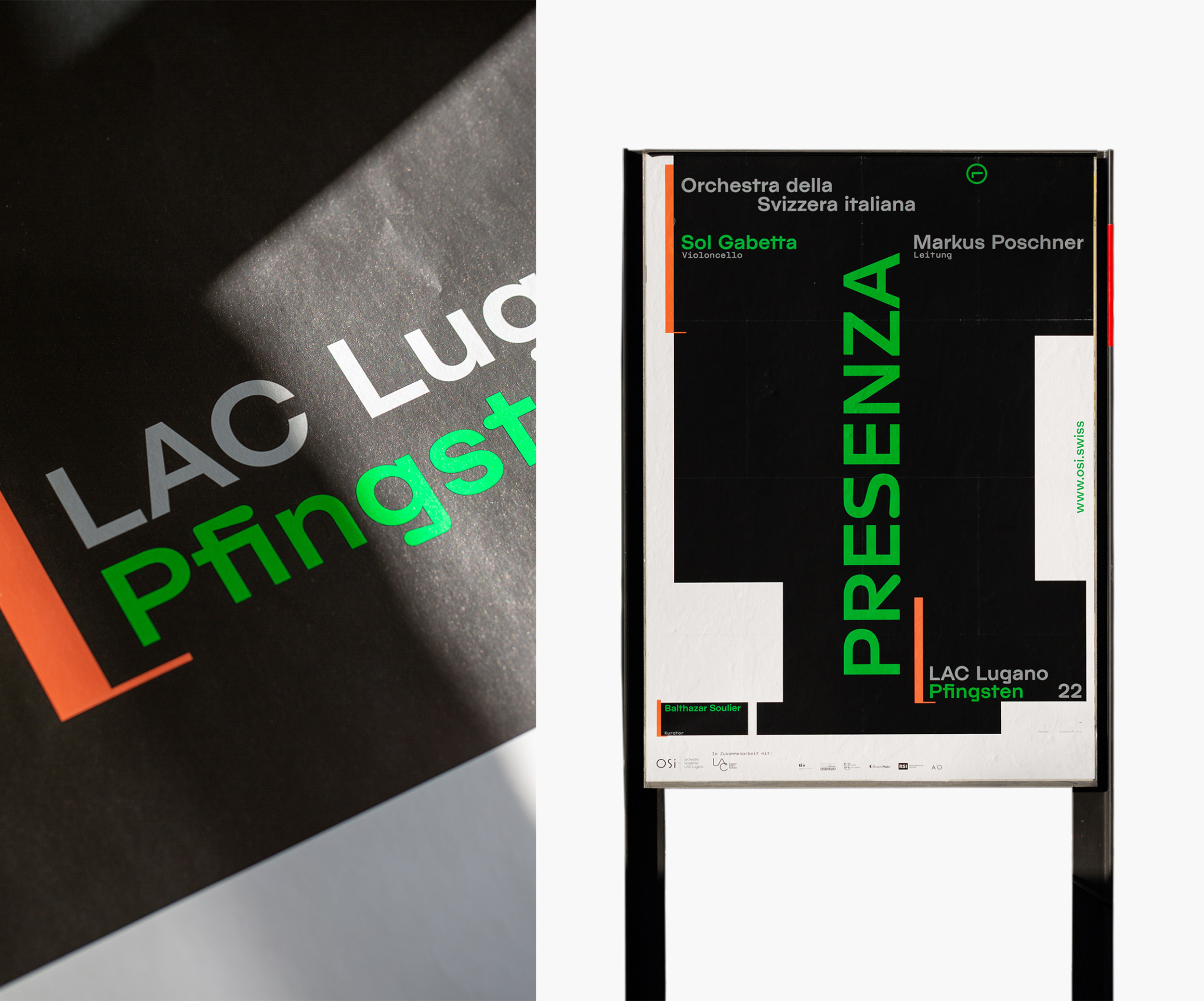
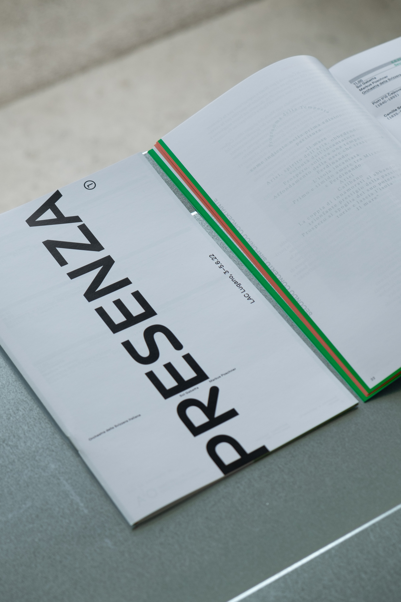
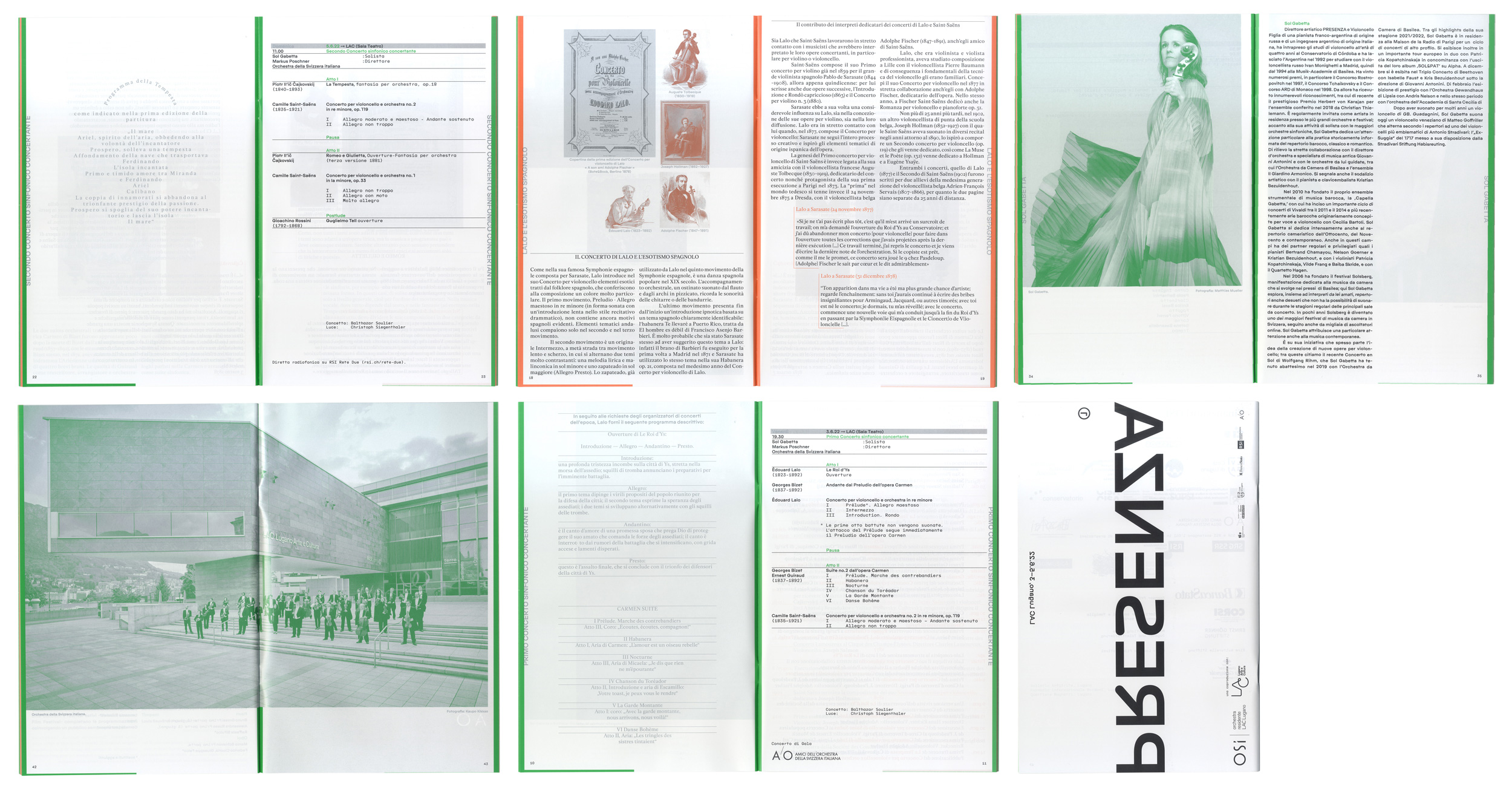
Visual identity for the experimental classical music festival Presenza; initiated by star-cellist Sol Gabetta, Balthazar Soulier and the Orchestra della Svizzera italiana (OSI). The identity consists of posters, flyers, animations, a magazine, various screen adaptations, as well as adverts. Our design concept refers to the visual language of notation systems and its translation into a typographic grid.
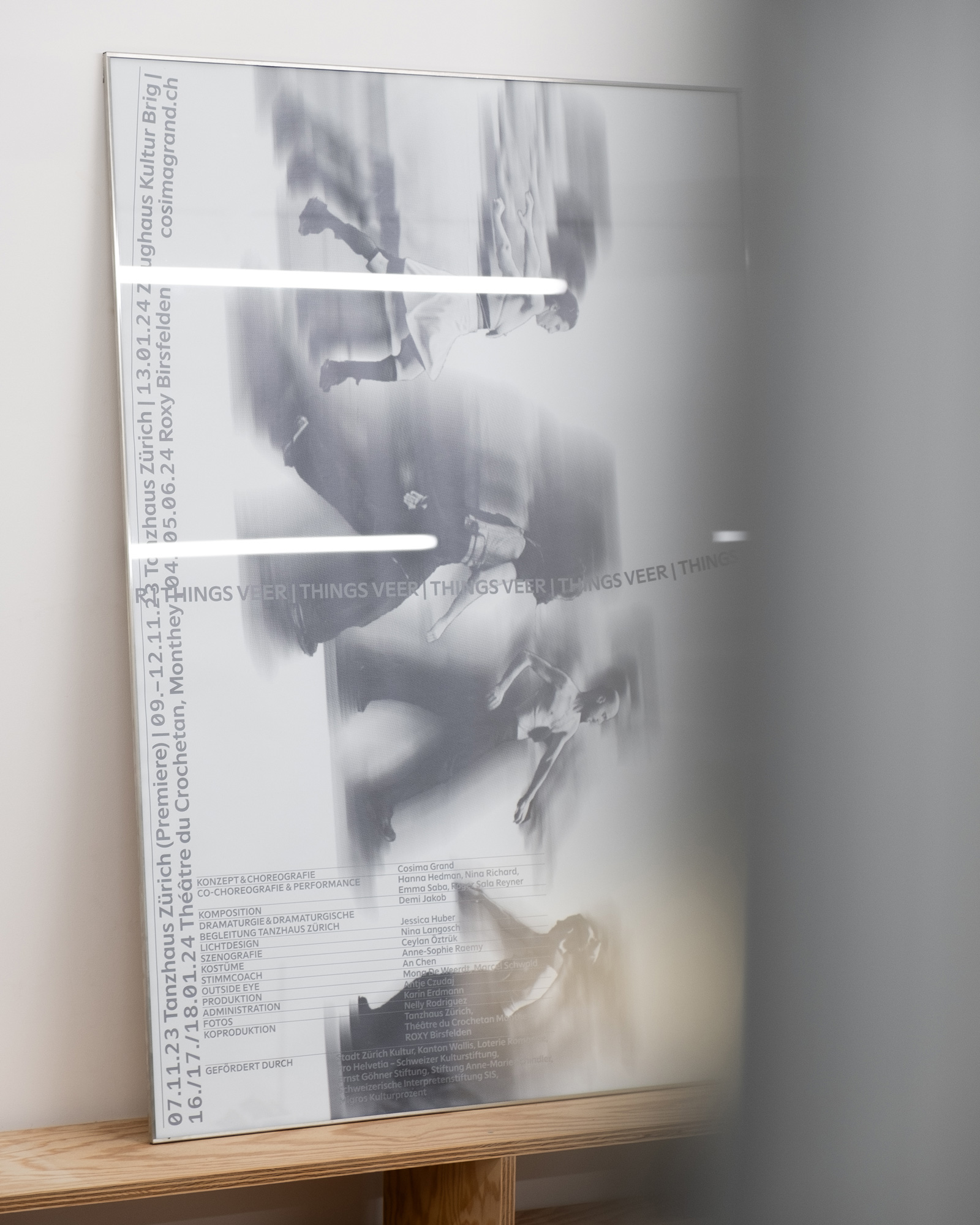
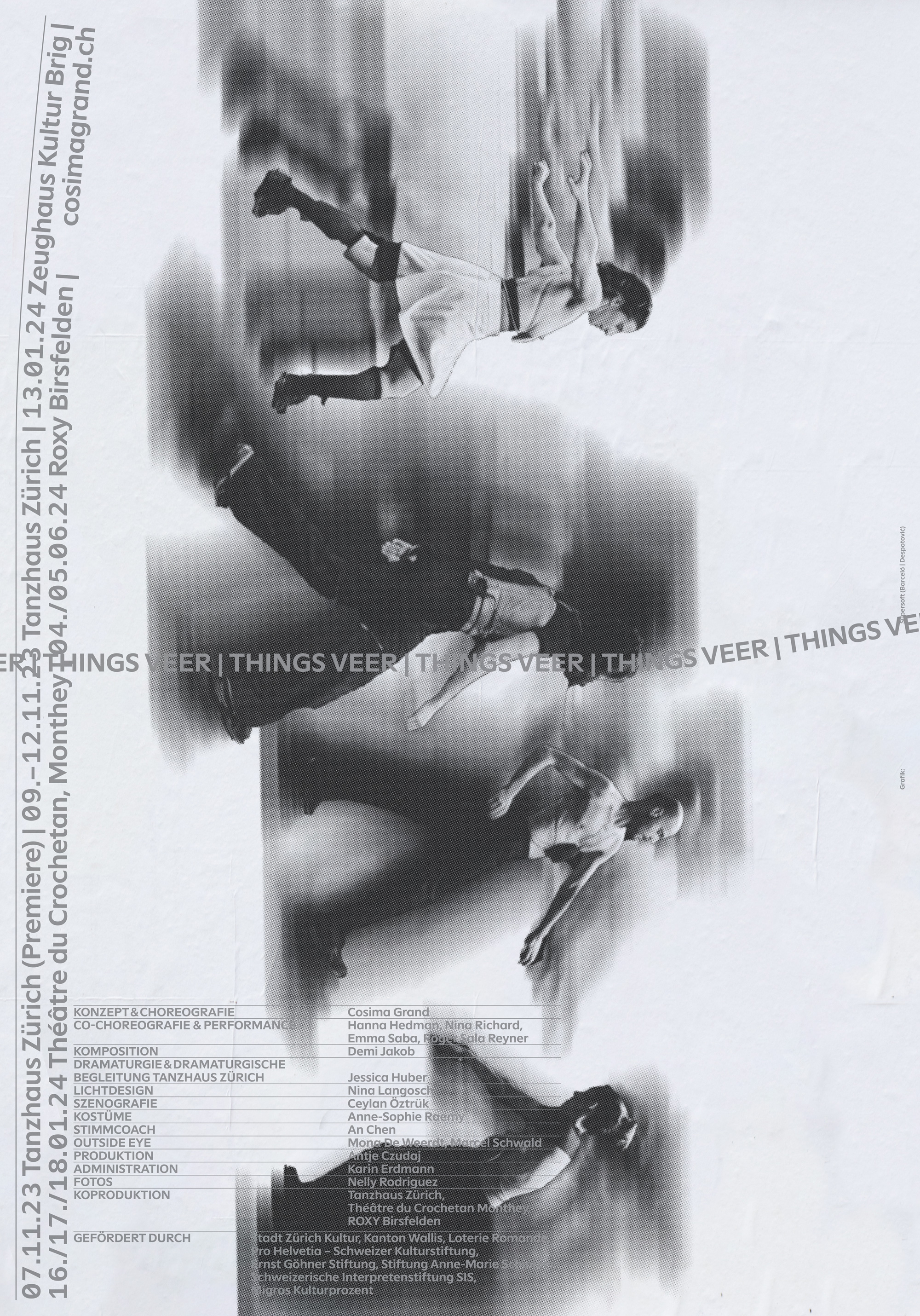
Poster, Flyer and Dossier for Things Veer, a new piece by Cosima Grand. “Four performers tread invisible paths. They oscillate and tune into each other and move in a cosmos of vibrating relationships. A kind of emotional formalism serves as the basis for their movements.”
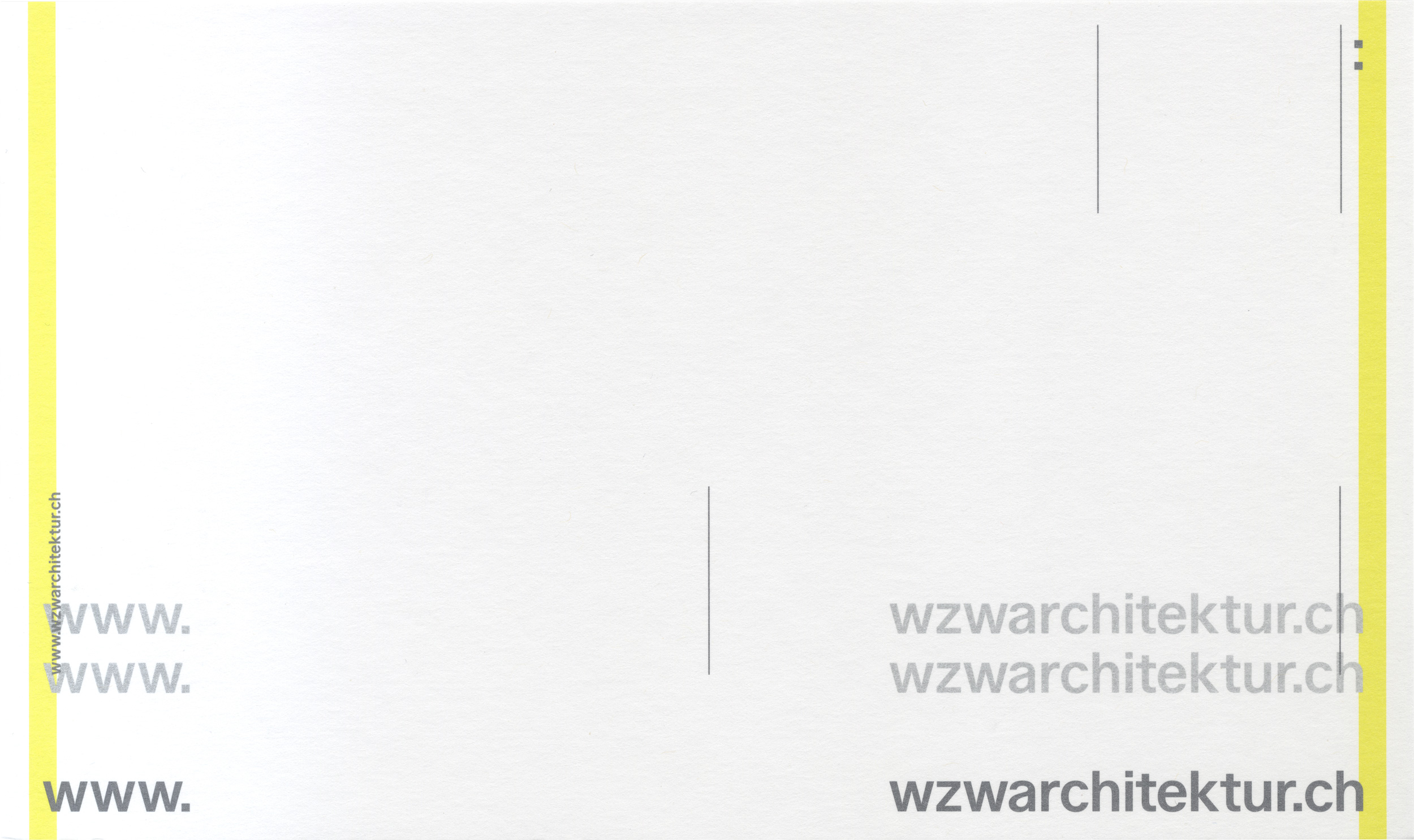
The new website and the visual identity for the architecture office is held together by the overlapping yellow stripes always containing the content. The website has a focus on a two-column page layout that, analog to a publication, is intended to invite visitors to view, read, and browse through the office’s work. Webcode by Felix Niklas
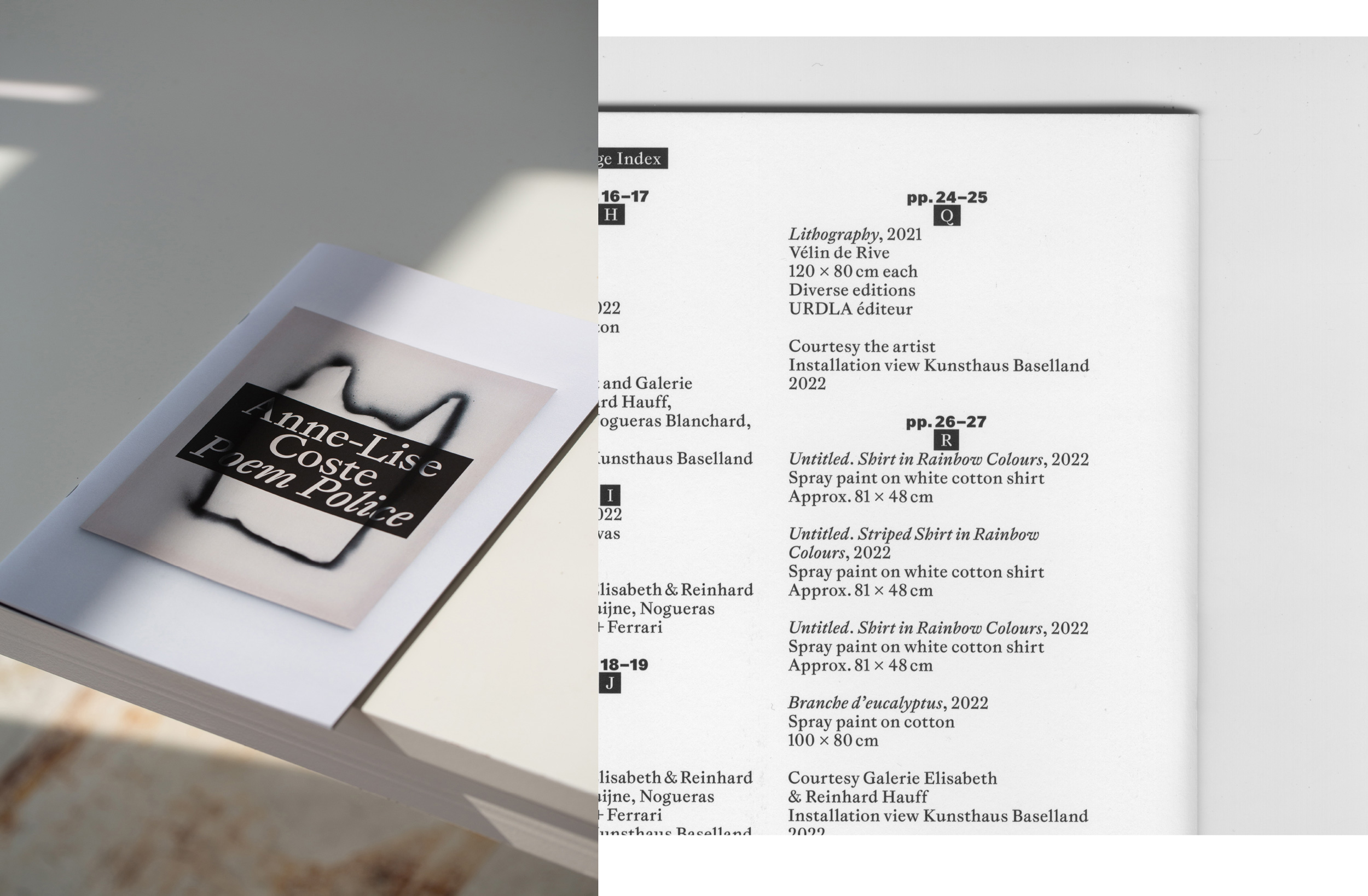
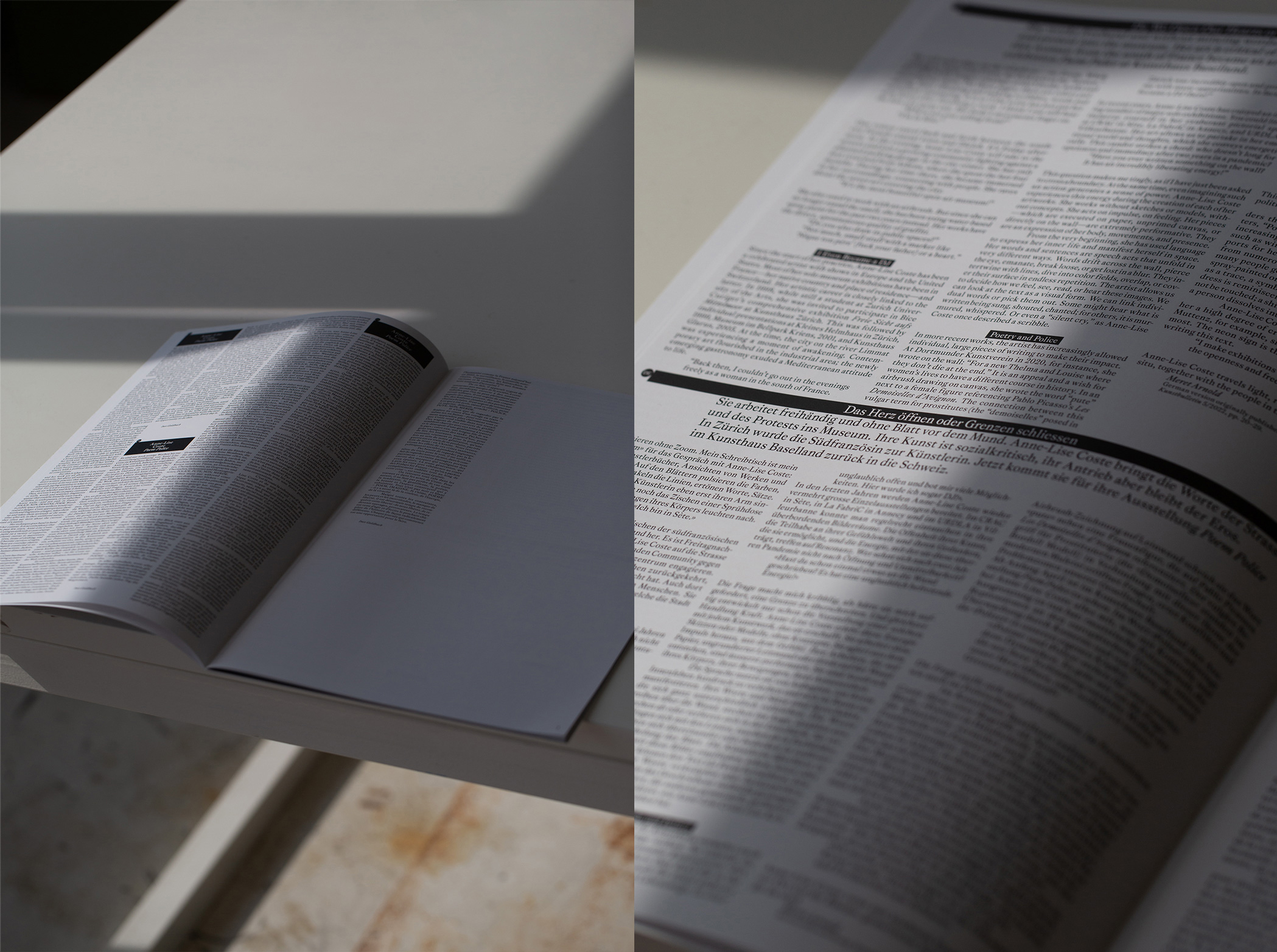
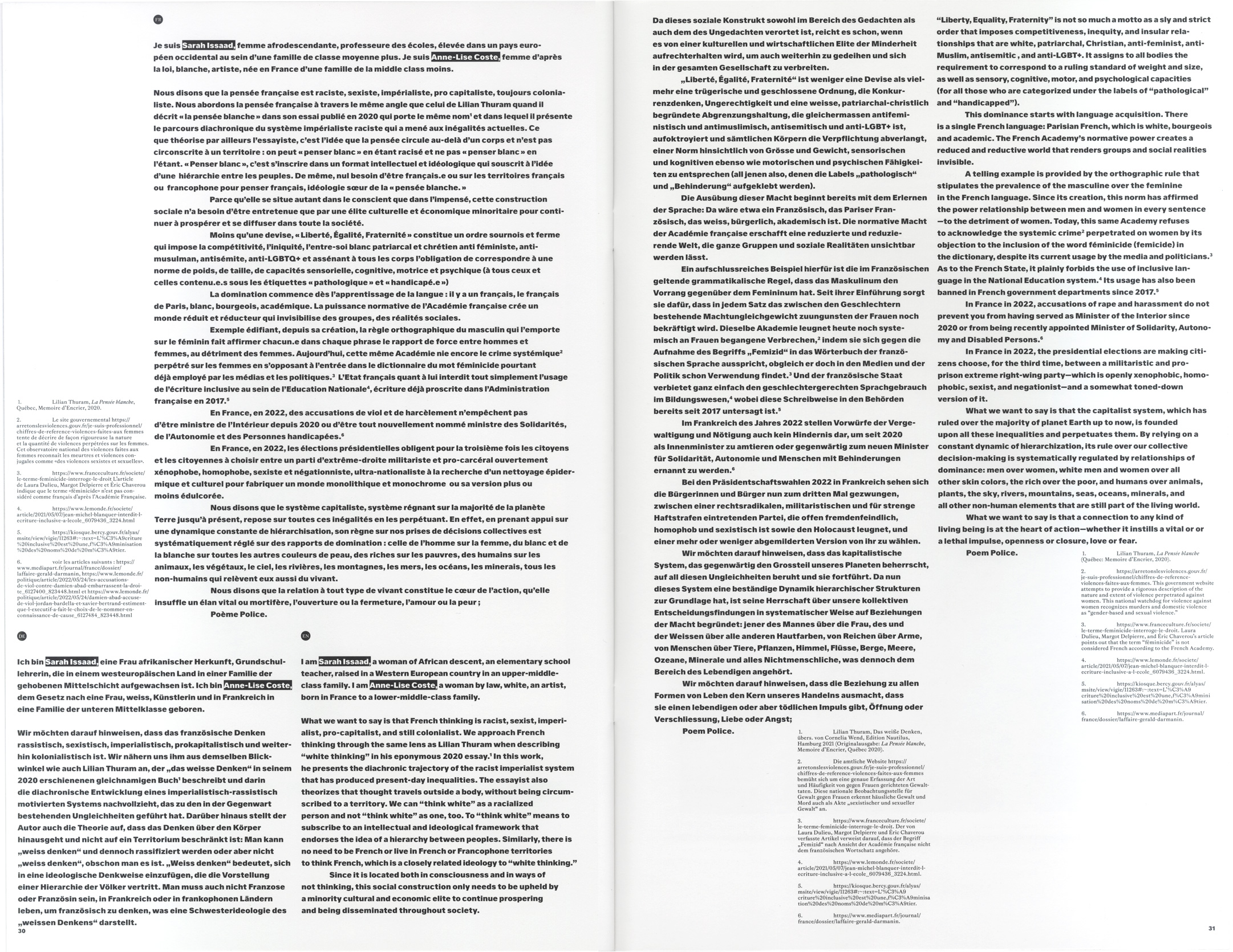
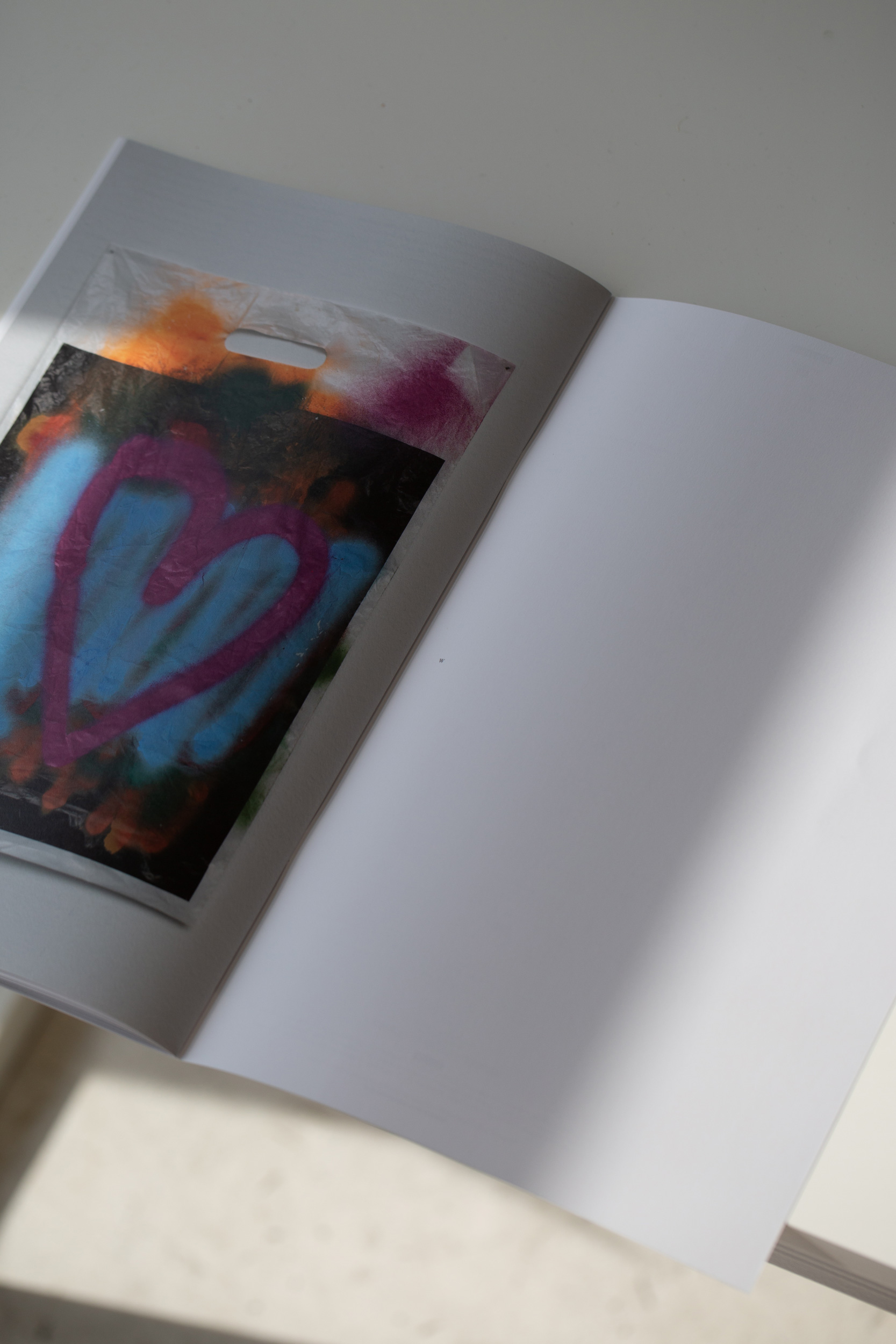
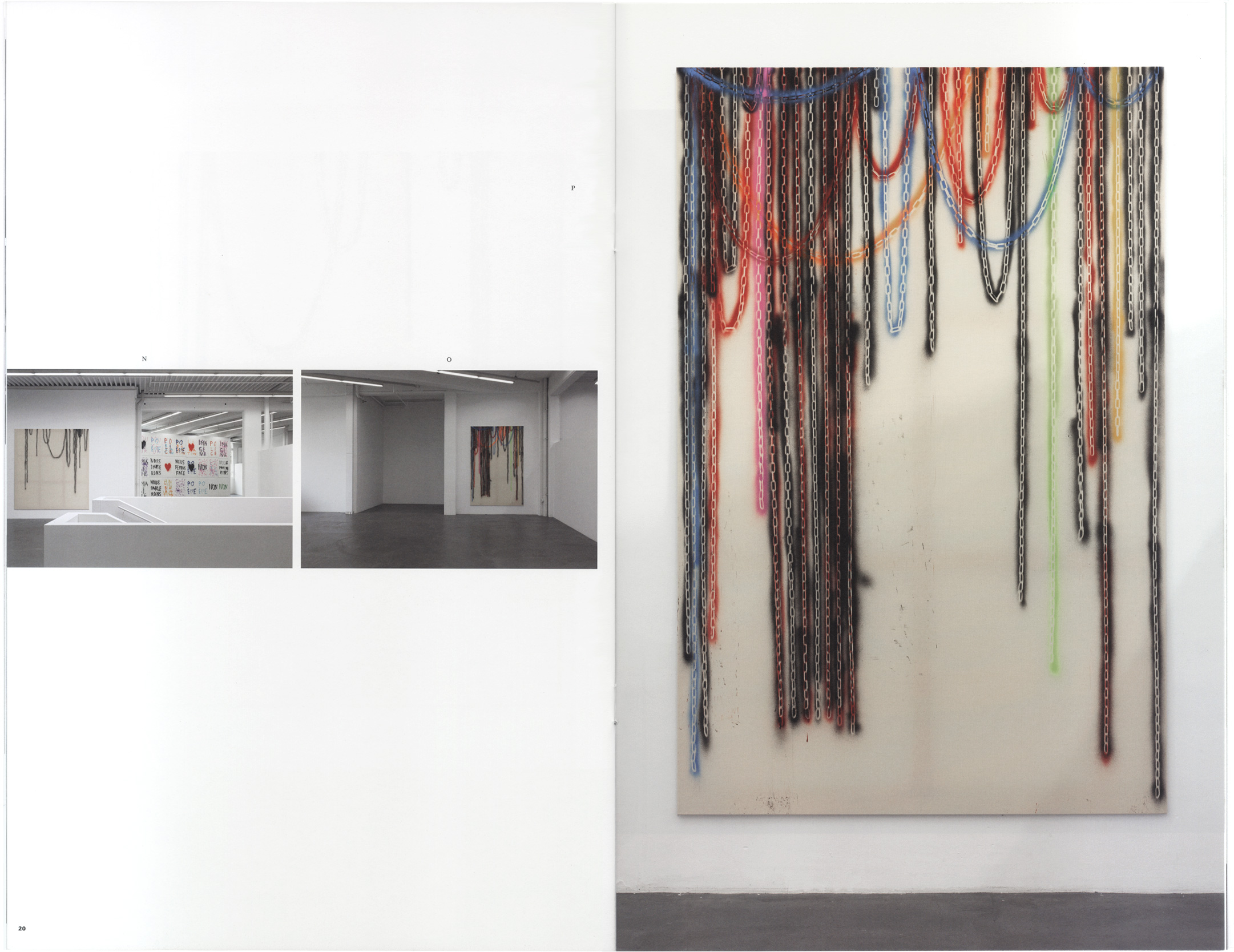
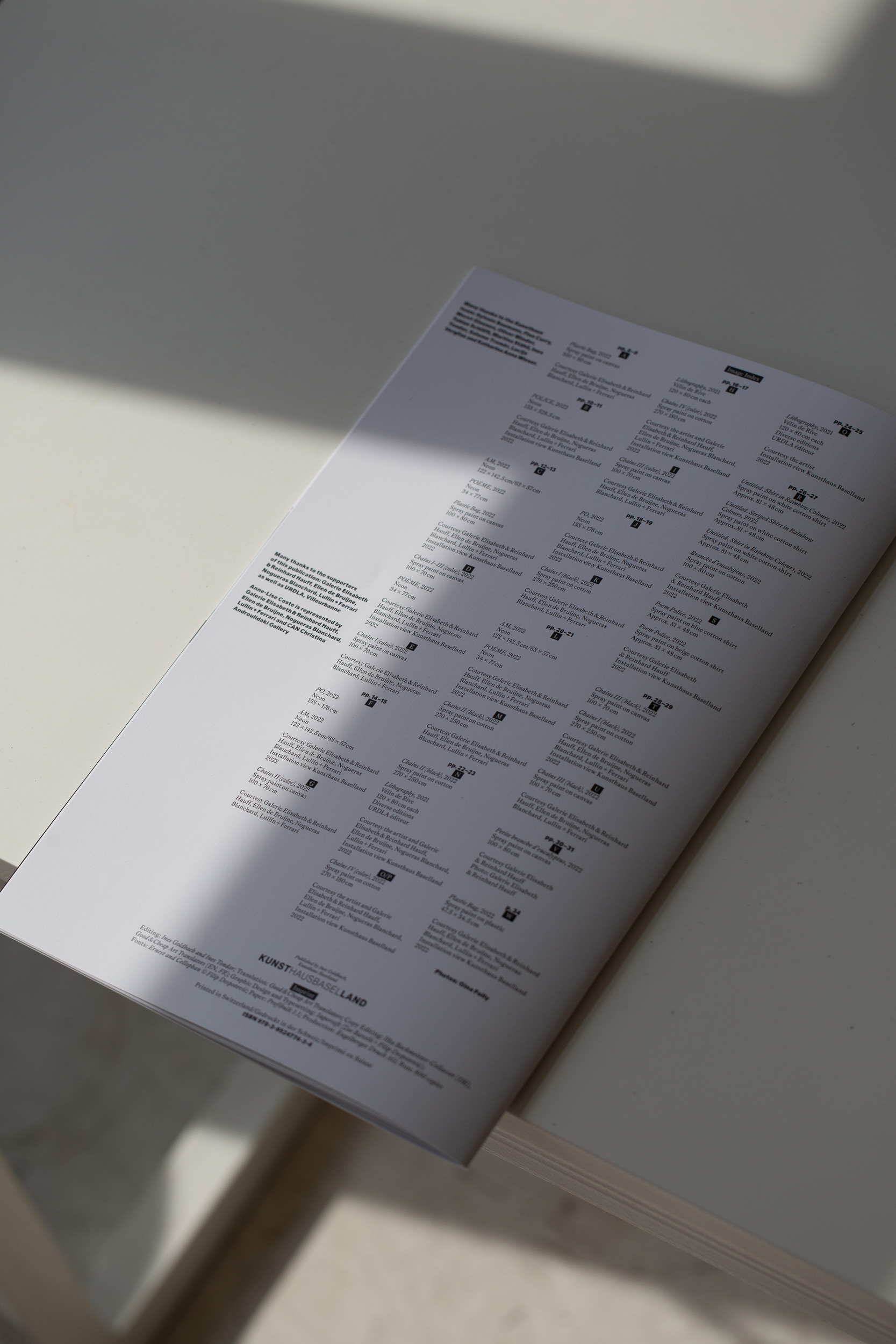
The artist publication “Poem Police” accompanying the exhibition of the same name by Anne-Lise Coste, references various forms of publications, from the poetry album to an art catalog to a manifesto.
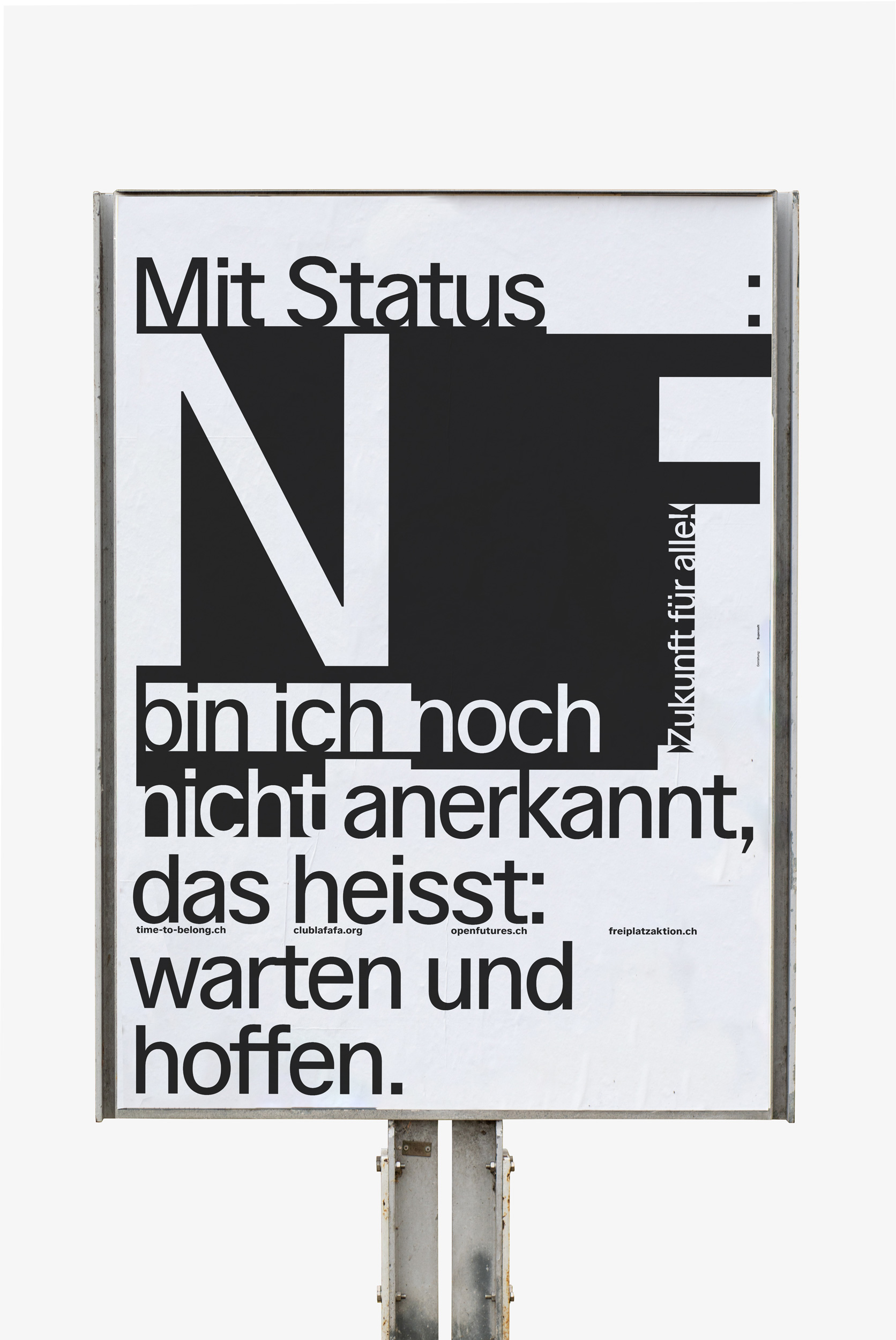
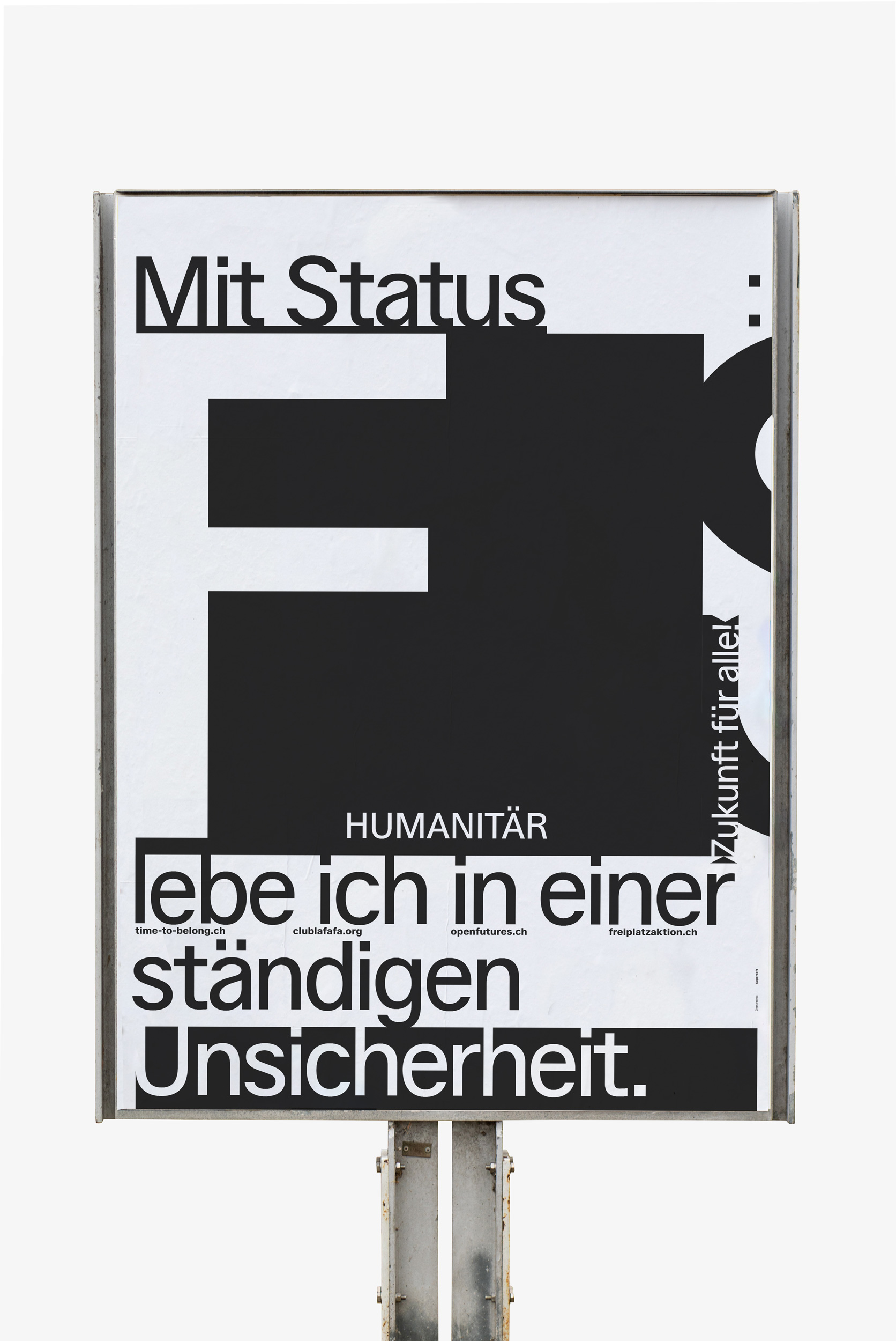
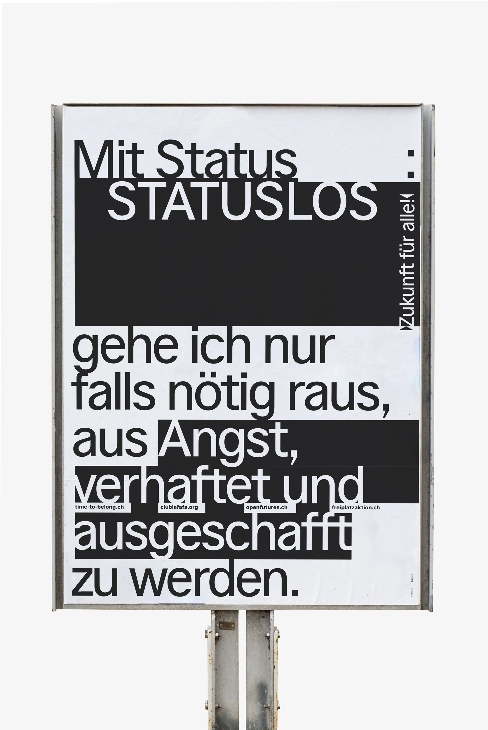
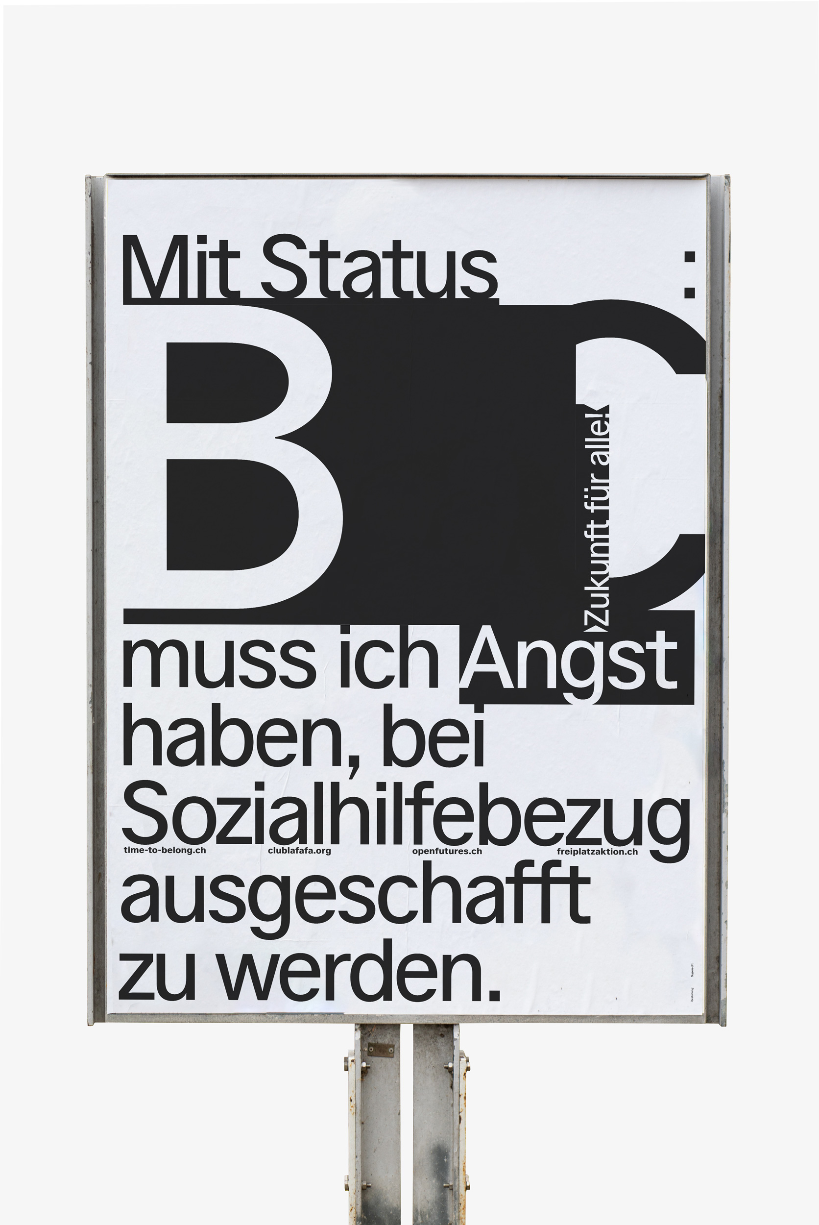
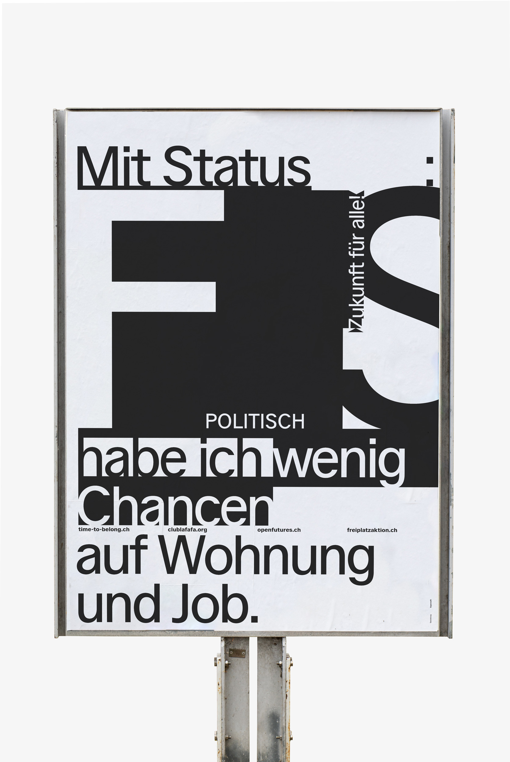
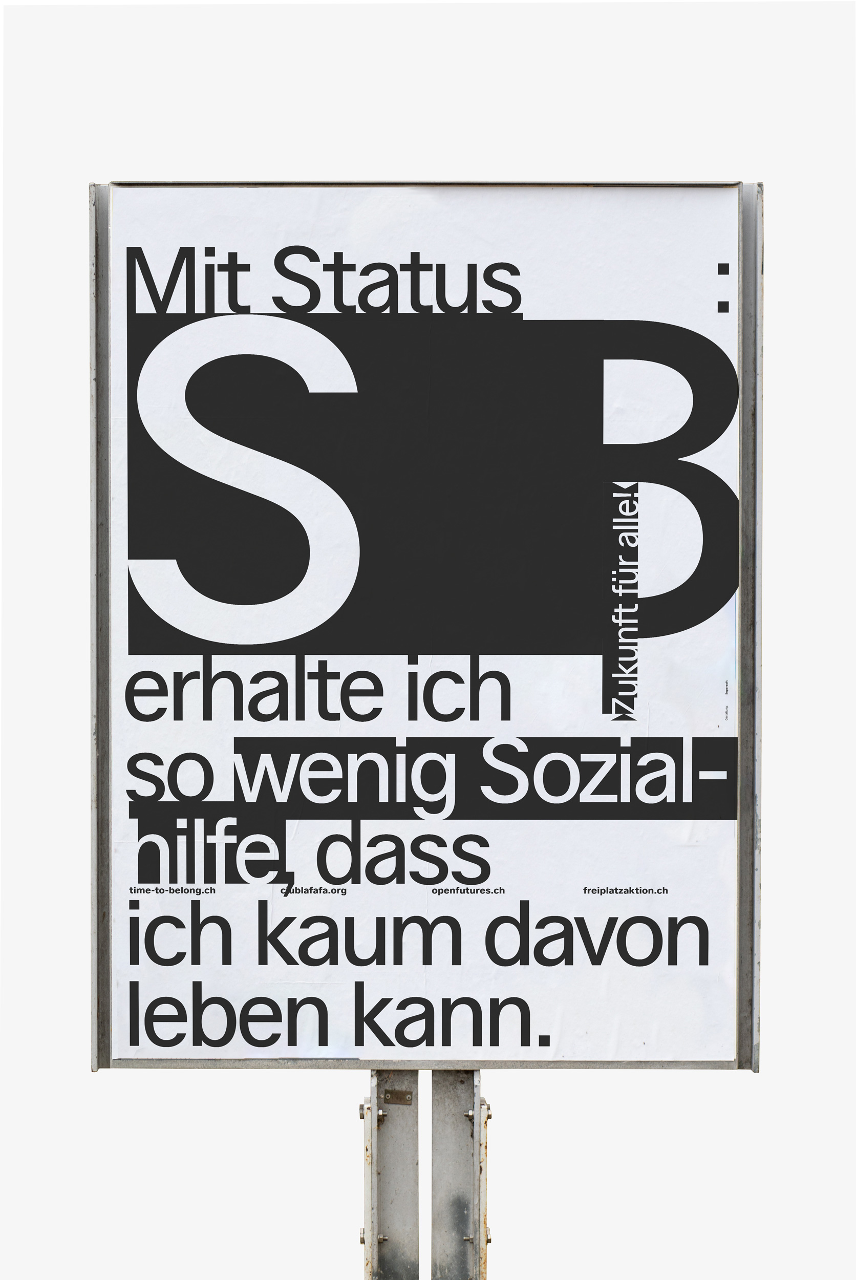
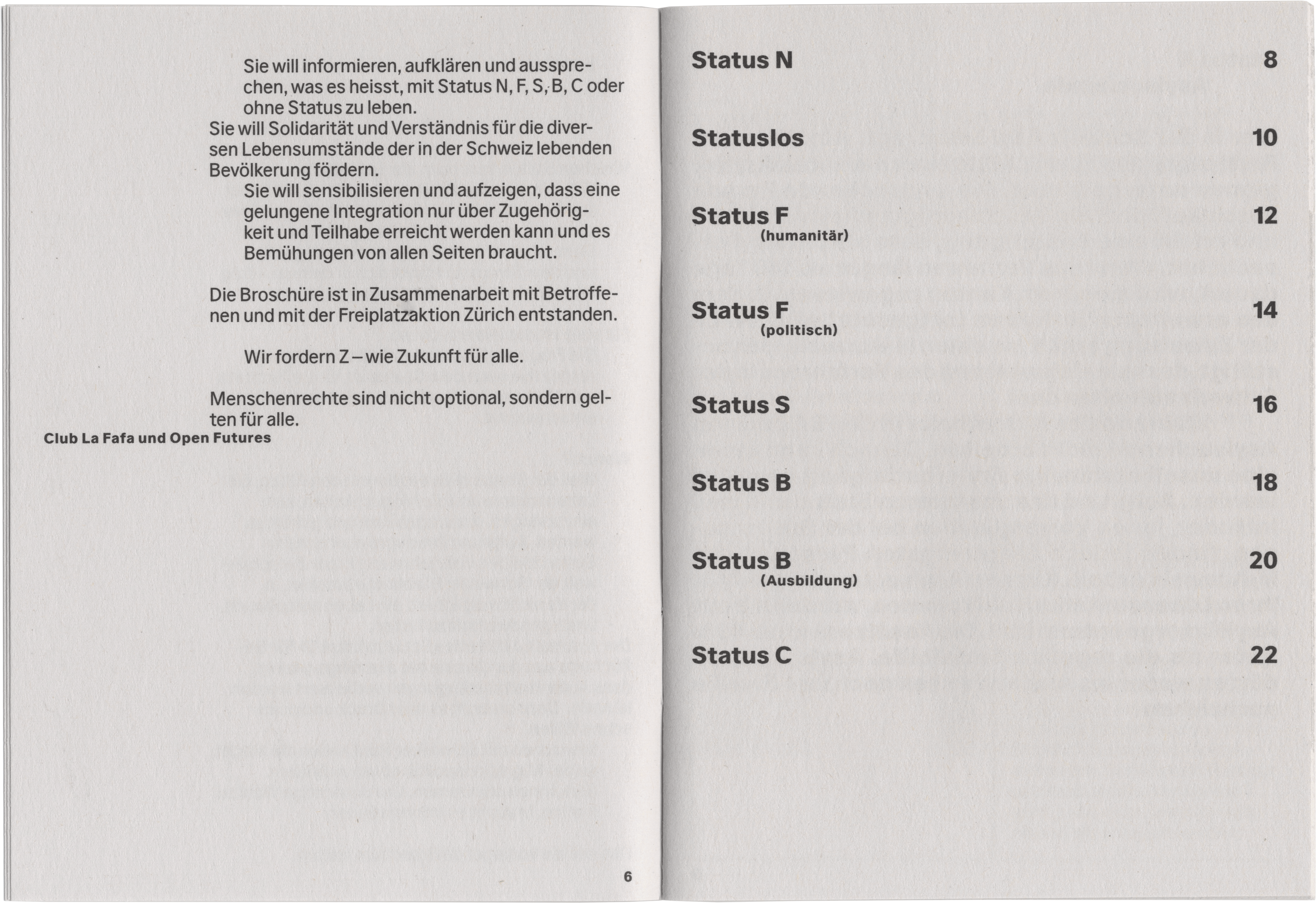
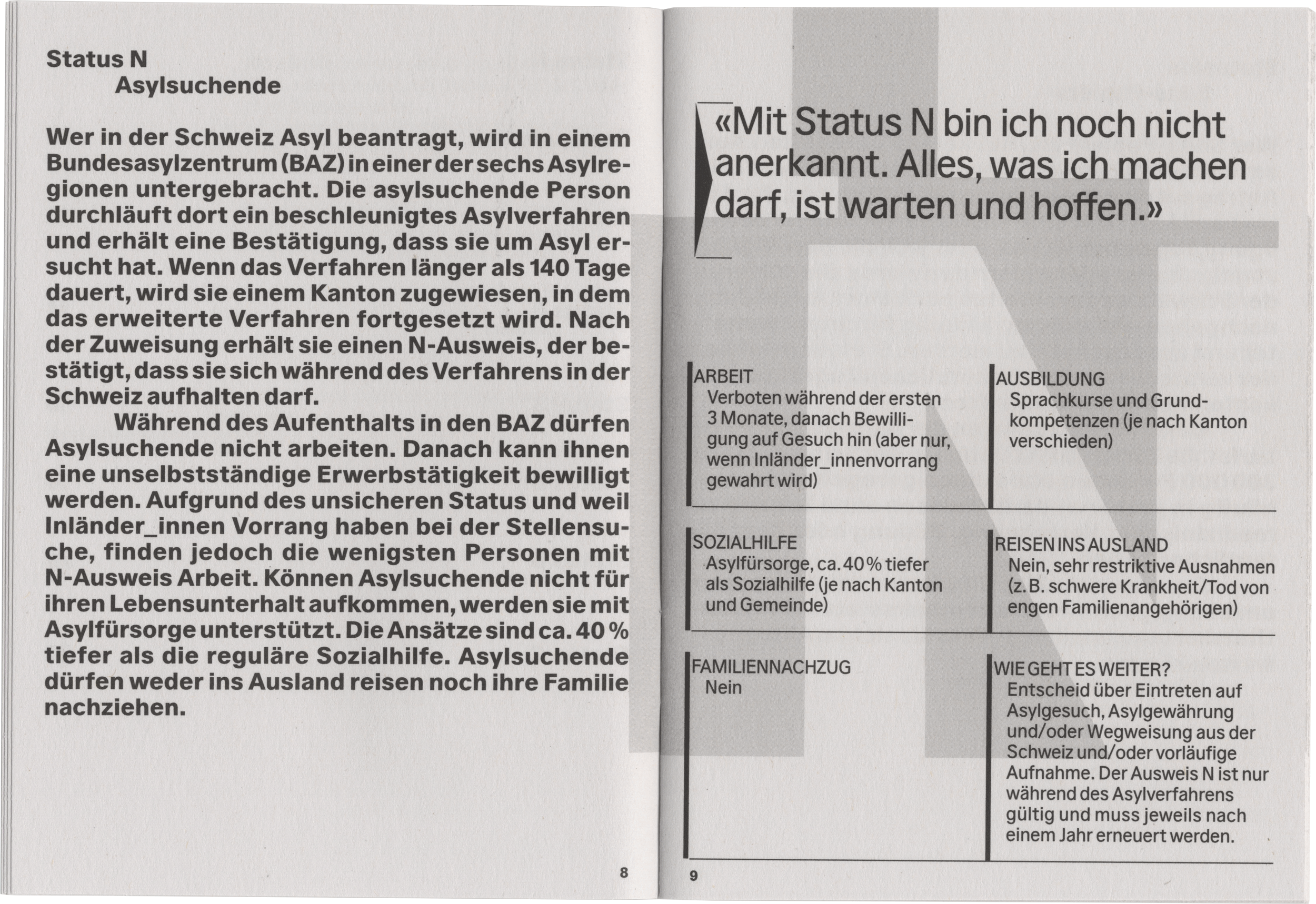
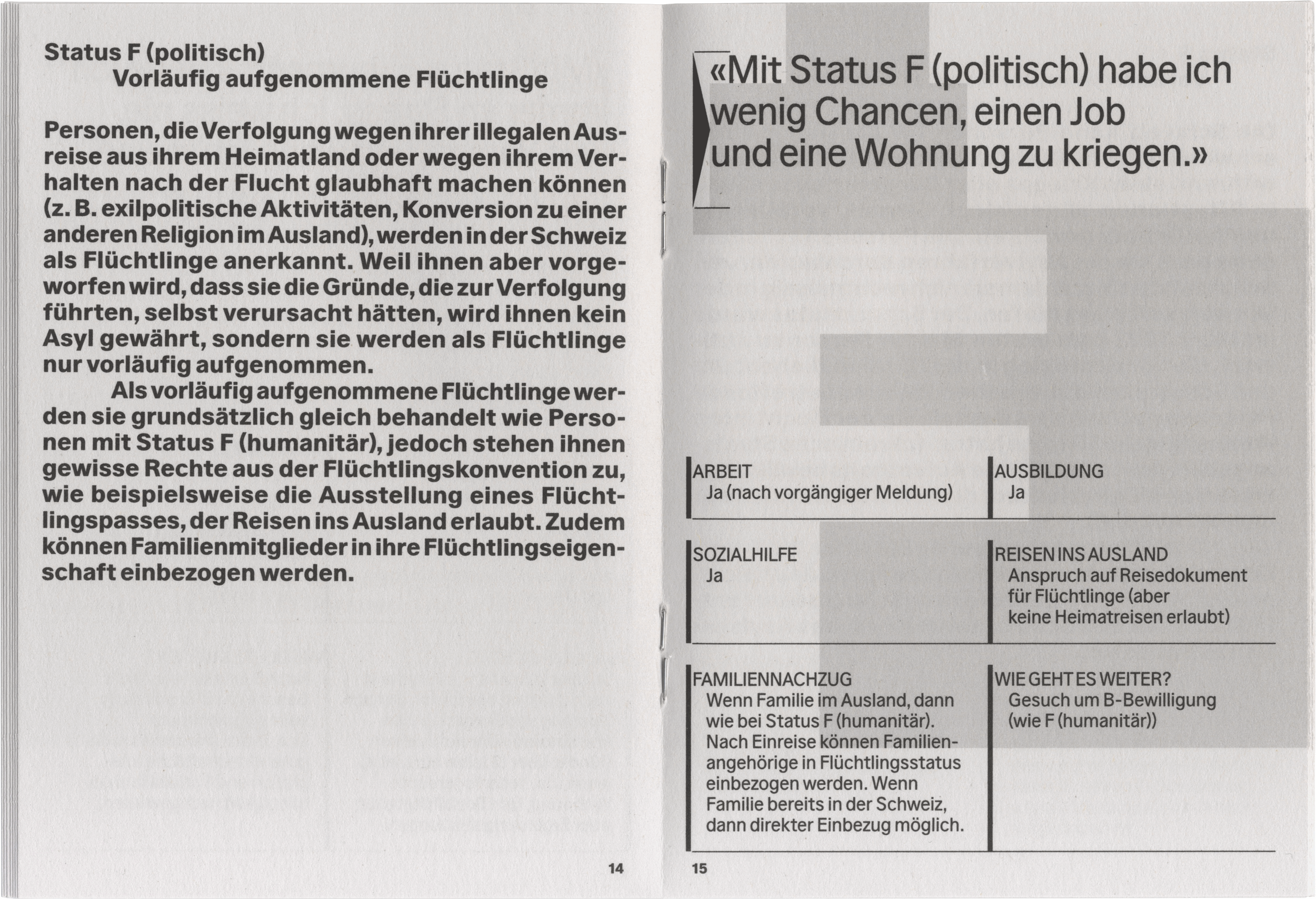
Info booklet and poster series for Open Futures and Club La Fafa in partnership with Freiplatzaktion Zürich, raising awareness on the residential status of refugees and migrants in Switzerland. N, F, S, B, C are not just letters, but they determine the lives of refugees and migrants in Switzerland!
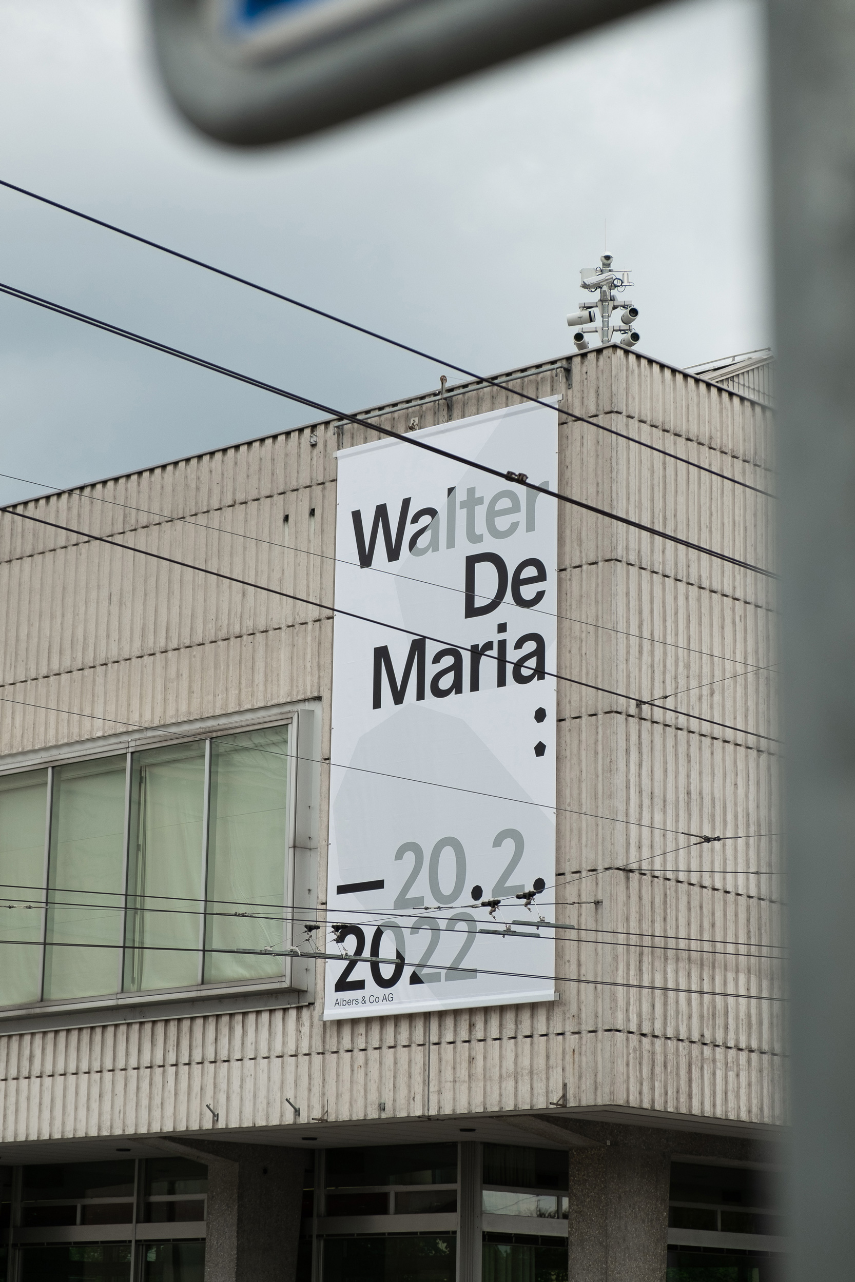
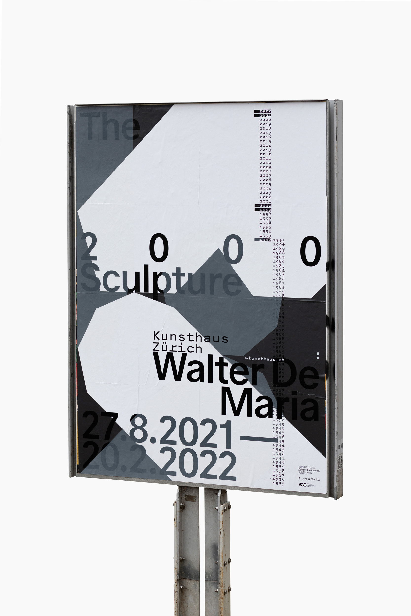
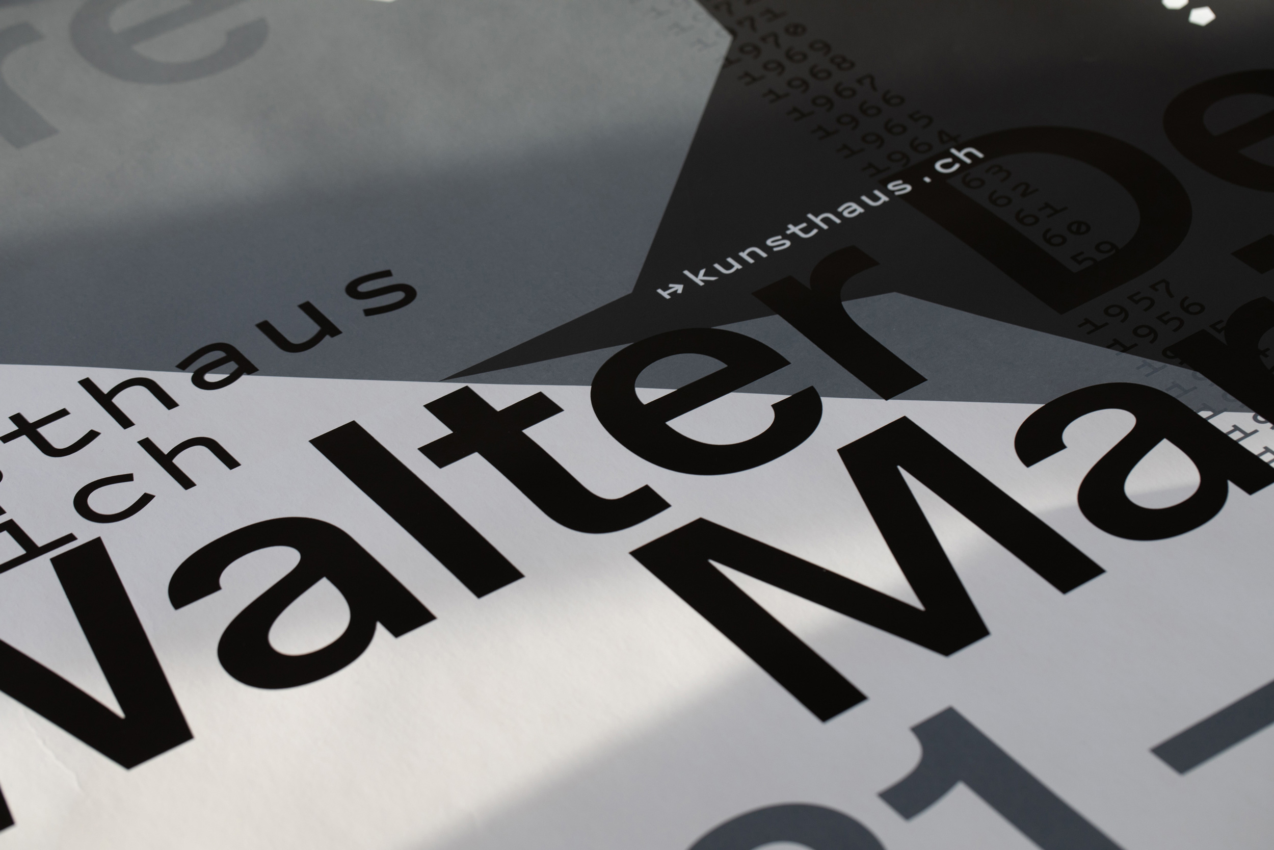
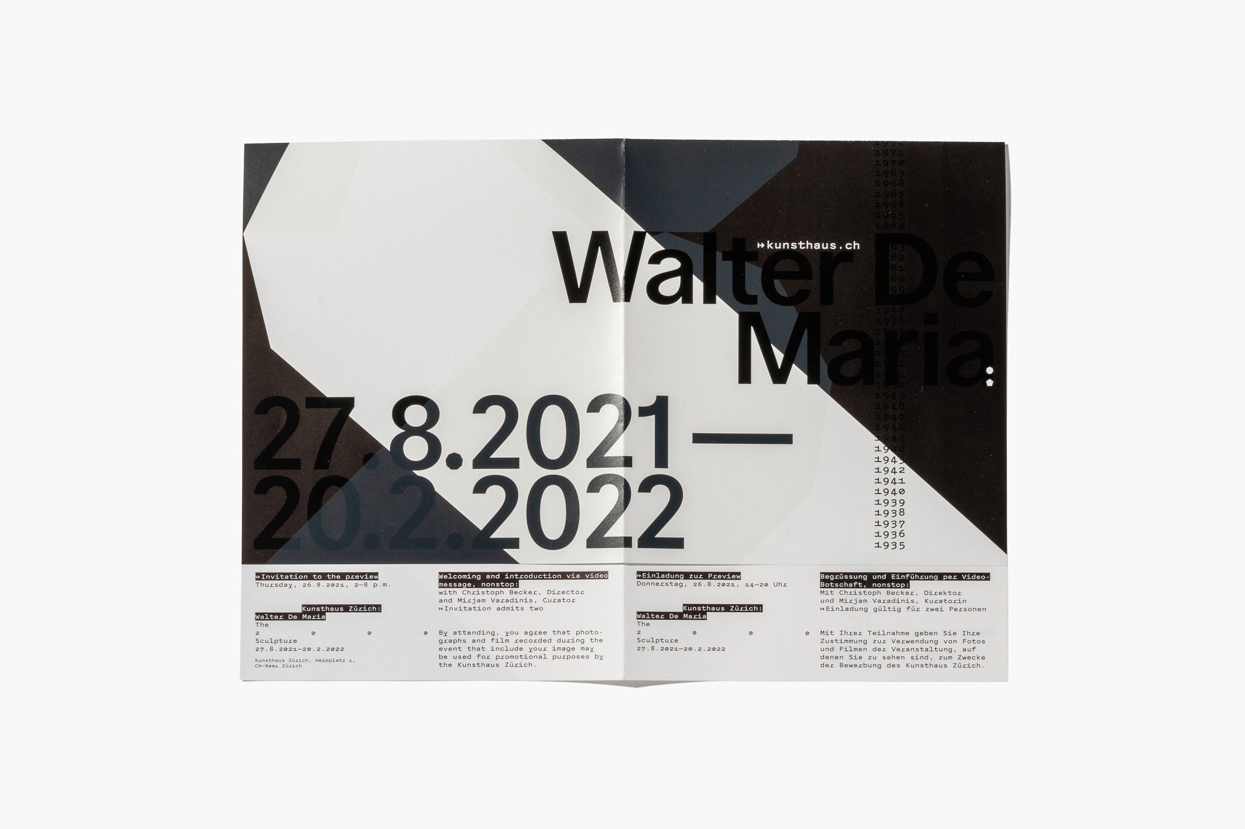
The design for this installation at Kunsthaus Zürich focuses on an areal, detailed view of the space filling artwork by Walter De Maria and unifies multiple perspectives and viewpoints through an interplay of printing techniques as well as the overlapping of shapes and typography.
As with the architecture itself, the website and identity for Barcelo Baumann Architects uses elements of layering, overlap and transparency to create a connection between graphic mediation and the architecture on display.
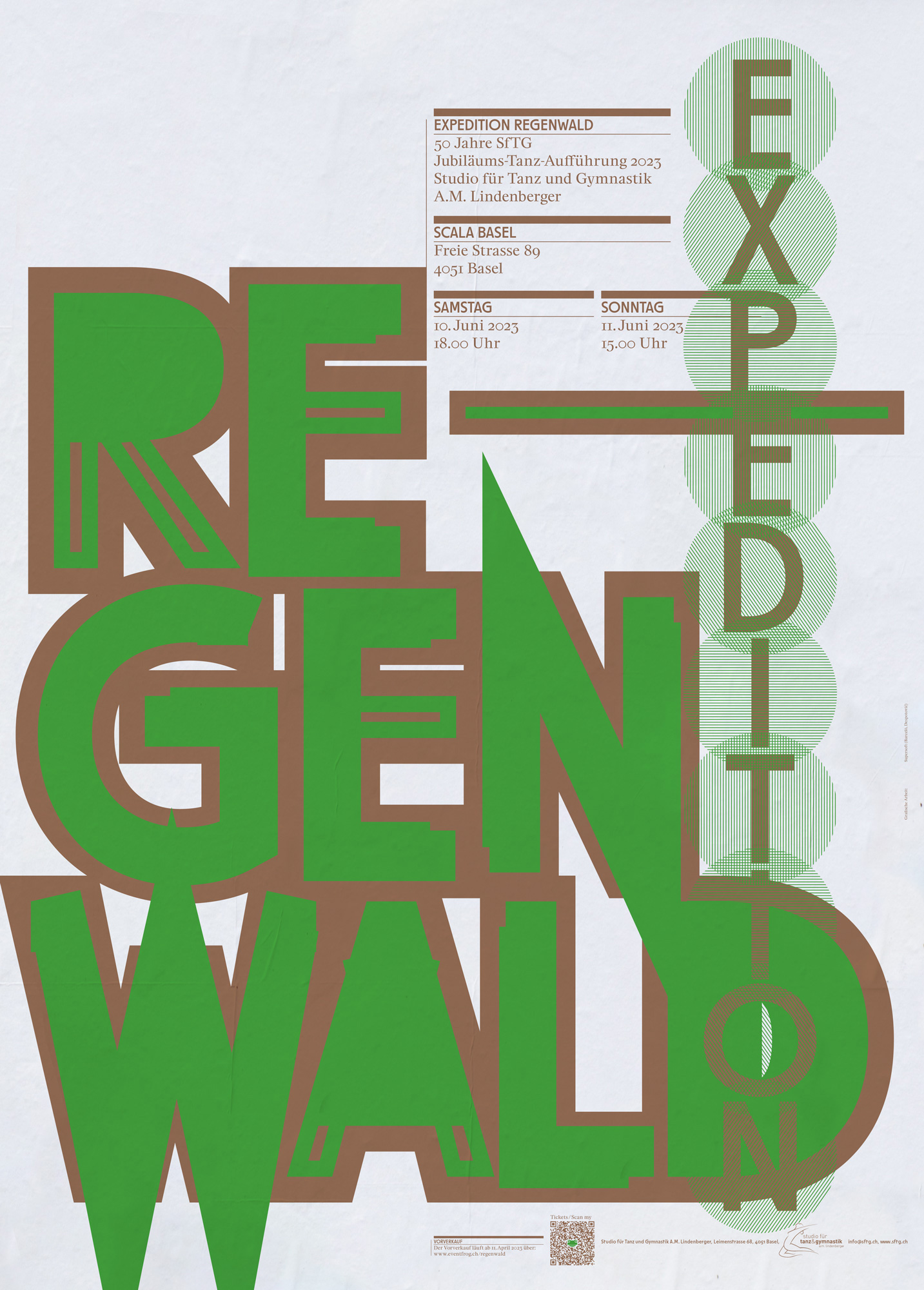
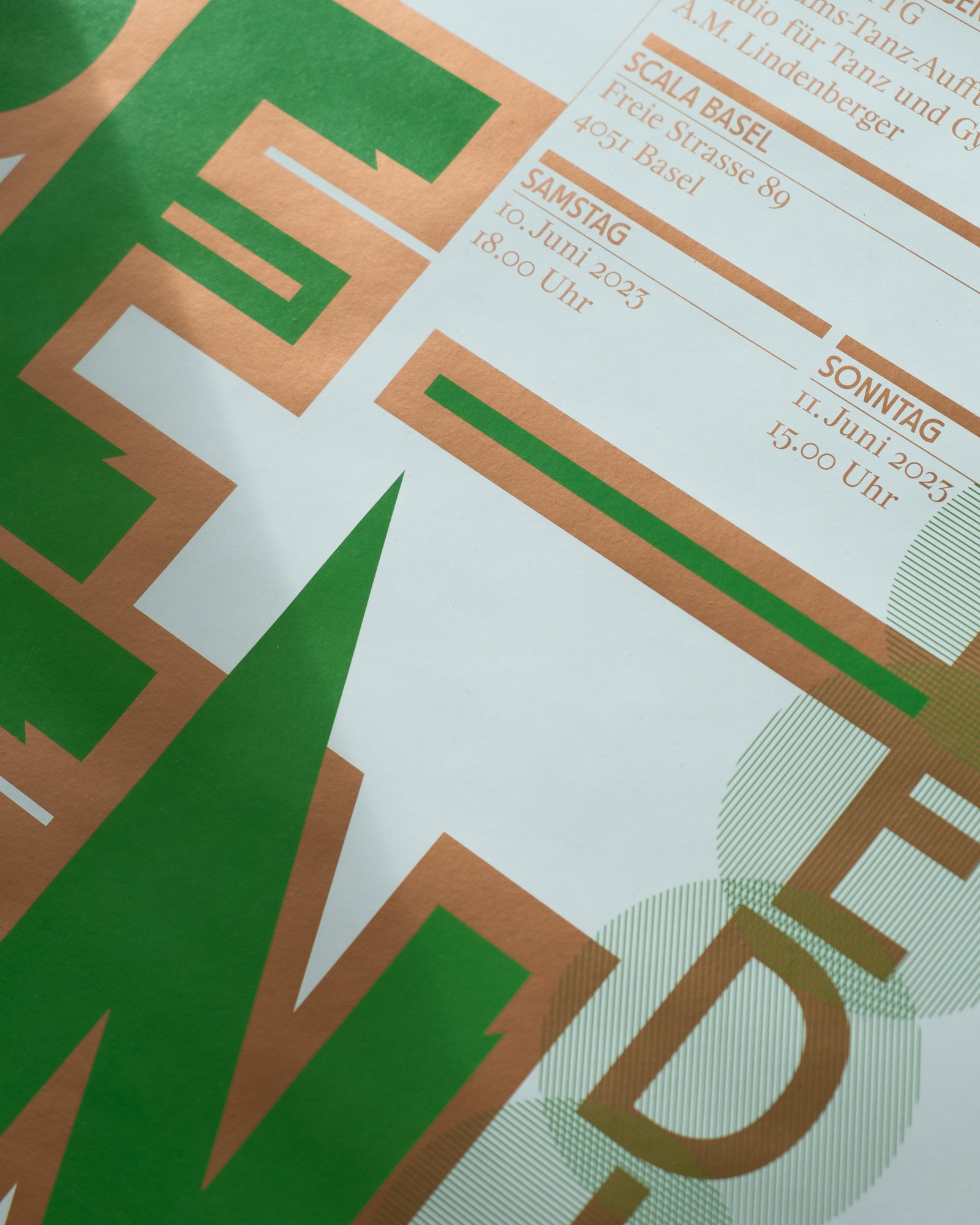
Poster and invitation for the 50th anniversary show of Studio für Tanz und Gymnastik Basel.
Web design for Turing Agency, a Zurich-based competence center for artistic explorations in the field of machines becoming human (and humans acting mechanically). The variable background icon functions as the agency’s mascot while simultaneously creating new shapes depending on the users cursor position. Webcode by Felix Niklas
S u p e r s o f t is a collaborative graphic design and art direction studio that gives shape to contemporary culture through graphic design and typography and is active in the fields of art, architecture, culture and education. Each design develops from the specific content and brief of the project, aimed at unlocking the potential and visual impact through design, creating an aesthetic bond between content and form.
c/o A7 Ateliergemeinschaft
- Art Directors Club Schweiz
- Barcelo Baumann Architekten
- Basler Papiermühle
- Club La Fafa
- Cosima Grand
- Filmpodium
- Gewona Nord-West
- Hochbauamt Kanton Zürich
- Langnau Jazz Nights
- Ketty Ghnassia
- Kornhausforum Bern
- Kunsthalle Basel
- Kunsthaus Baselland
- Kunsthaus Zürich
- Open Futures
- Open House Basel
- Pascal Flammer
- Rhyschänzli-Gruppe Basel
- Sol Gabetta
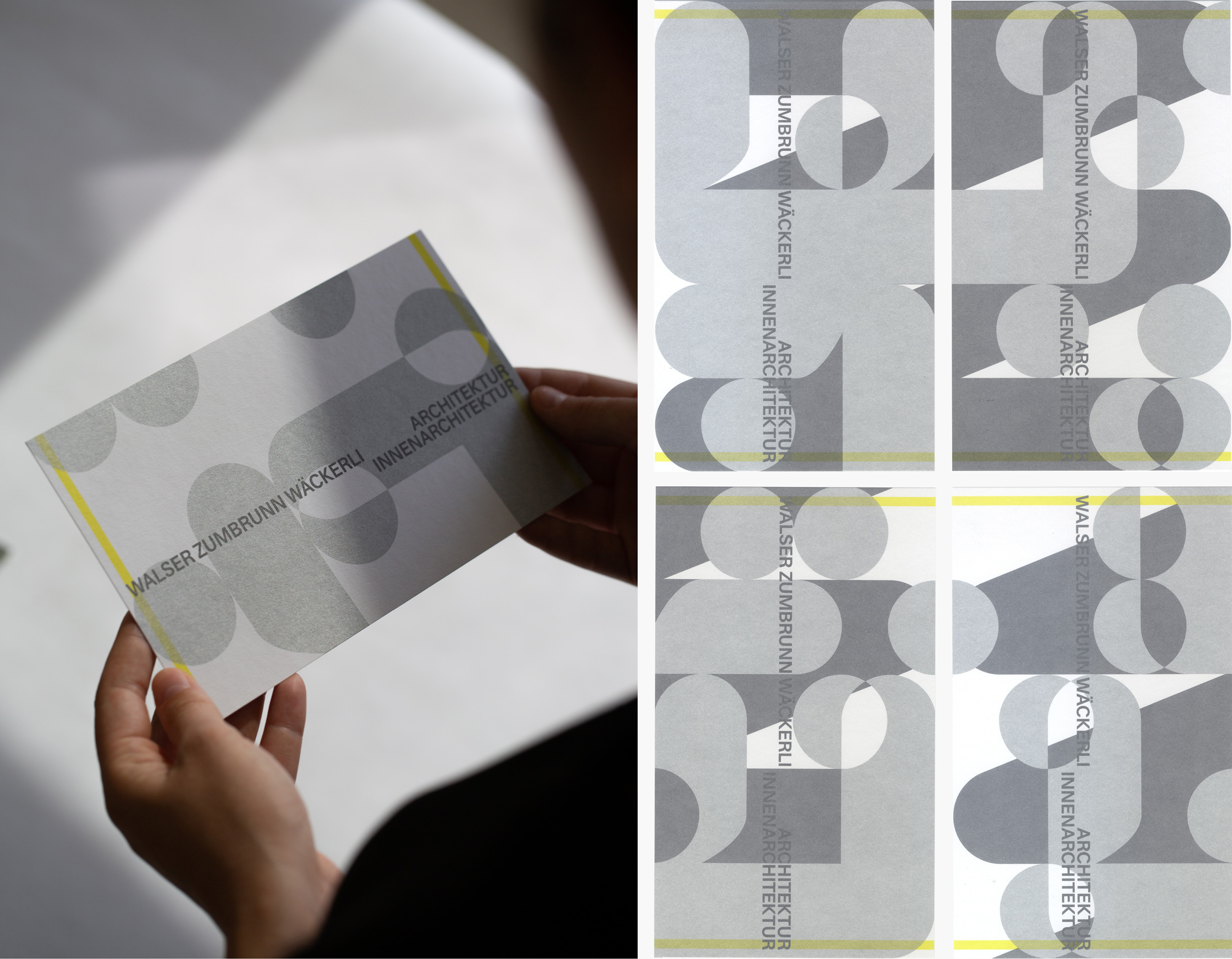
- WZW Architektur
- Wohngenossenschaft Zimmerfrei
- Zurich University of the Arts
- 2024 Swiss Design Awards Nomination
- 2022 Nomination Prix Netzhdk, Zurich University of the Arts
- 2021 Article in wohnrevue Magazine, October Issue 2021
- 2021 Lecture, Experimental Learning Lab, Zurich University of the Arts
- 2020 Pro Helvetia Starting Power Program
- 2020 Nomination Förderpreis, Zurich University of the Arts
- 2018 100 Beste Plakate 18 Germany, Austria, Switzerland (Langnau Jazz Nights 2018)
- 2017 100 Beste Plakate 17 Germany, Austria, Switzerland (ADC Creative Week)
Typefaces: Filip Despotović
Images: Supersoft